After starting my research and drawing down a few different scamps I started looking into creating patterns. At this point I knew that I was going to use the name “Earth-First”, this led me to combine the colour scheme of “earth” which is light blue and green, alongside my second idea which is kintsugi. Kintsugi is an art form of mending broken pottery by putting gold onto the cracked/ broken areas as a form glue, this leaves the cracked areas visible but in gold form. This art of mending pottery represents a few various ideologies, we know this as Fouhy, C. (2023) said “Kintsugi also teaches us to value our relationships and connections. Just as the broken pieces of pottery are brought back together with precious metals, our relationships can be strengthened through the challenges we face together.” Through this I created a pattern that both symbolised the earth and the value of relationships together. This led me to my first initial idea to look like this,
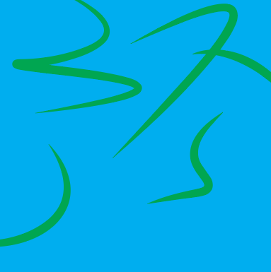
First pattern attempt
After applying the pattern onto my masthead I ended up with my first concept.

This combines the kintsugi pattern with the earth colour scheme. I tested this pattern onto the “Etna” typeface. However after seeing this outcome I decided I should experiment more as I didn’t find this colour scheme appropriate for an editorial masthead. This led me to creating an alternate black and gold variant of my pattern.
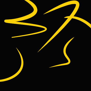
Final Pattern
This black and gold pattern is more reminiscent of traditional “kintsugi” which bring the kintsugi idea to life. I applied this onto the “Earth-First” masthead and ended up with the following outcome.
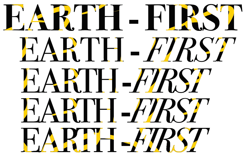
Masthead Experimentation
Here is the pattern and type experimentation that I have went through, I already knew I wanted a serif typeface to keep an elegant and high quality feel to the brand which is why I chose the “Etna” typeface. I first tried the pattern on “Etna Black”, this is because the pattern would be more visible on the thicker type. However I felt that this took away from the elegant feel of the typeface which led me to settle for the “Etna Light” variation of the typeface. Next I tried various experimentation by changing the “First” section to be in italic. This is to provide emphasis on the prioritization of earth. I next tried various pattern positioning to ensure enough of the yellow lines are visible on the new typeface.

Final Masthead
In this final masthead I decided to keep the elegant aspect of the typeface, however I wanted to introduce the idea of connecting people together which is represented by the kintsugi, however to reinforce this idea I connected all the letters together at the serif edges. I also chose this specific variant of the the pattern as it shows the most of the golden kintsugi lines making the pattern more recognizable and iconic to my brand.
References
Fouhy, C. (2023) Kintsugi – a powerful visual metaphor for living.
Available online: https://fxmed.co.nz/kintsugi-a-powerful-visual-metaphor-for-living/#:~:text=Kintsugi%20also%20teaches%20us%20to