Titles
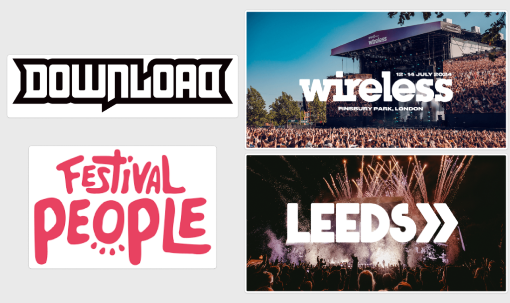
Popular festivals have varied typography styles with Wireless and Download festival being more traditional with straight lettering however others such as Festival People and Leeds are more “rough” and “free-handed”. The wireless festival will feature a revamped logo, this logo will use a sans serif typeface as it’s the common trend for festivals as this helps represent and big and bold the festival events are.
Landing Page
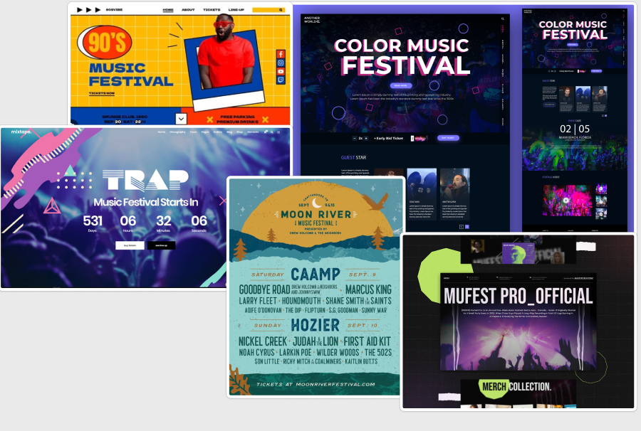
Similarly to the logo typography, the research shows that the trend in music festival home pages is to use bold sans serif typefaces for the titles, this again is to match and represent the boldness and size of the festival itself. The mass body text is also in a sans serif font, however this time it is regular instead of bold. This is to help with the legibility of the body text for users, especially users who may be visually impaired.
High-Fidelity Plan
The High-Fidelity prototype will feature a bold sans serif typeface used for the logo, this is due to the logo being on of the key features and factors in the festival, as the logo will be prominently shown everywhere from banners to merchandise. This logo will represent and show users what the festival is about and will help with advertisement as the logo will be recognisable.
The title text will follow the trend found inside of the research conducted and will also be a sans serif typeface, this will help bring attention to key information and help highlight buttons and titles that have higher importance over others, which will help guide the user in the correct direction on the website and app.
The mass body text will follow the same pattern with a regular sans serif typeface, this is to keep the branding feel united together amongst the website and app. It will also help users who are visually impaired clearly read large blocks of information as the type is much more clear in a mass text setting in comparison to a serif typeface.