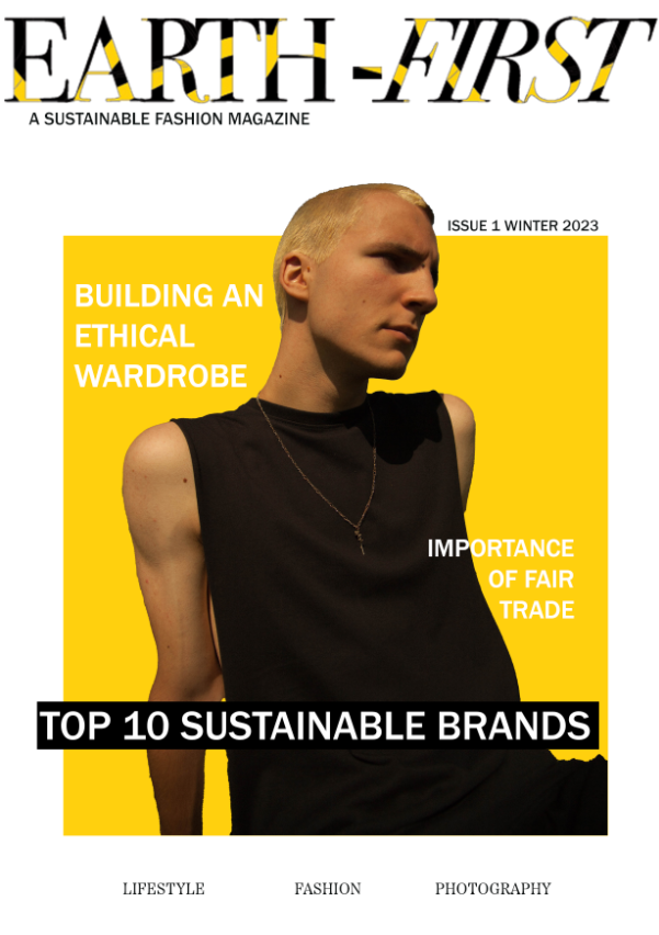
First Magazine Cover
I wanted to keep a consistent slick and minimal feel throughout all of my designs, knowing this I decided to use a Honeycomb Yellow block in the centre of a white background, this created a focal point at the centre of the magazine making it eye catching to passersby. At the top I placed the “Earth-First” masthead, I ensured that this was the largest text throughout my designs to follow the text hierarchy. This ensured that the viewer would at least glance at the masthead and remember the masthead. I used photography to place a model onto the centre of the block after selecting and masking them, however I made the top of the model’s head stick out of the box to add more depth to the cover, doing this also created a item that was unique to the “Earth-First” brand.

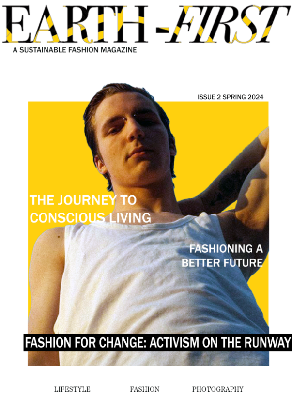
Second Magazine Cover
For my second cover I followed a similar layout, I used a large masthead with “A SUSTAINABLE FASHION MAGAZINE” in bold serif type. The typeface I used is Franklin Gothic Medium as this typeface contrasts the large serif masthead and follows the typographical guidelines which I have set for the brand. I then used a zig-zag pattern for my subheadings, as this would guide the viewers eye easily from the top to the bottom of the magazine cover without creating too much cluttered text, this also makes the design look more visually interesting and appealing to the viewer. This design is clearly part of the “Earth-First” brand due to the repeating unique identifiers such as the top of the model’s head again sticking out of the Honeycomb Yellow box.

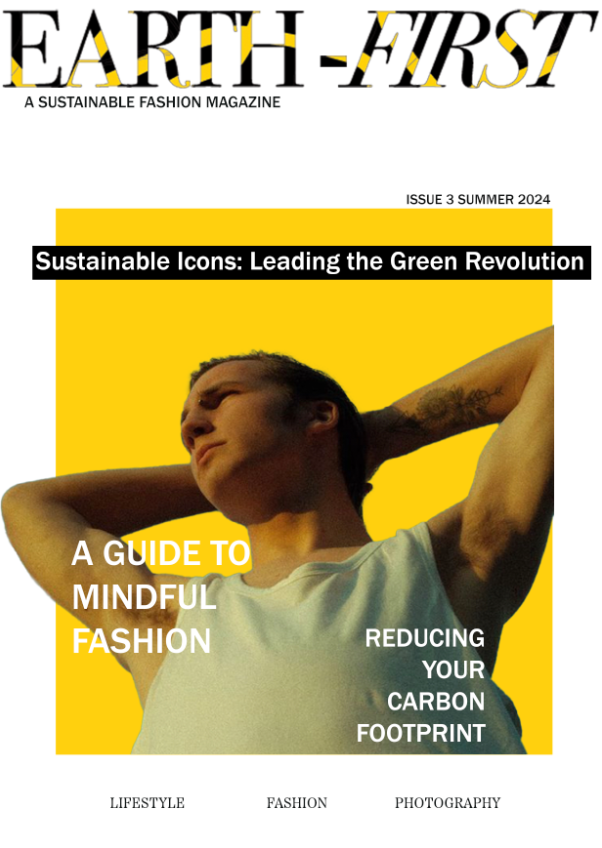
Third Magazine Cover
In my last magazine I experimented with larger subtitles and having the main black strip subtitle at the top. This was to have an increased variation in my covers meanwhile staying true and identical to the brand guidelines so that the magazine can be easily identified as a “Earth-First” magazine to viewers. I added three smaller titles at the bottom of each magazine to inform the viewer on certain subjects they will find inside the magazine. I used a the serif typeface “Etna Regular” to have bold looking text at the bottom, but not have them take away the spotlight from the nearby titles above. Overall all three magazine clearly belong to the same brand which was my primary goal whilst experimenting with title layouts due to having differently positioned models.