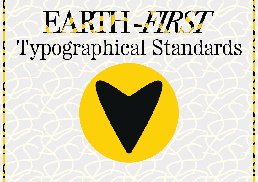
Earth-First Introduction Page
I started off my typographical standards with an introduction page, this is to show the style of the typographical standards that is expected to be seen by the client throughout the different pages. I used the same kintsugi pattern as the main background with 80% opacity, this so the pattern would not clash with the text on the page whilst still linking back to the logo of the brand. I added a reverse colour strip on both sides of the pages to keep the design symmetrical whilst adding a little bit of flair. The heart graphic in the centre is to reduce leading and add onto the friendly atmosphere.
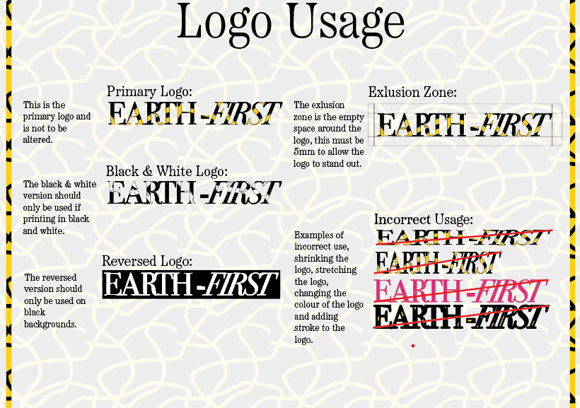
Logo Usage
My first slide is about logo usage. This slide provides the client with information on how to and how not to use the logo. Here I provided three clear examples of the colour variations of the logo: one in colour, one in black and white and on in reversed. I added a reversed version. On the right hand side I provided the client with an exclusion zone so that the client knows for future reference how much of a gap to leave to allow the logo to breathe. Underneath in a list of incorrect usage which includes stretching/ distorting the logo, changing the colour, removing the pattern or adding extra stroke. This is to stop any confusion and keep the brand recognizable.
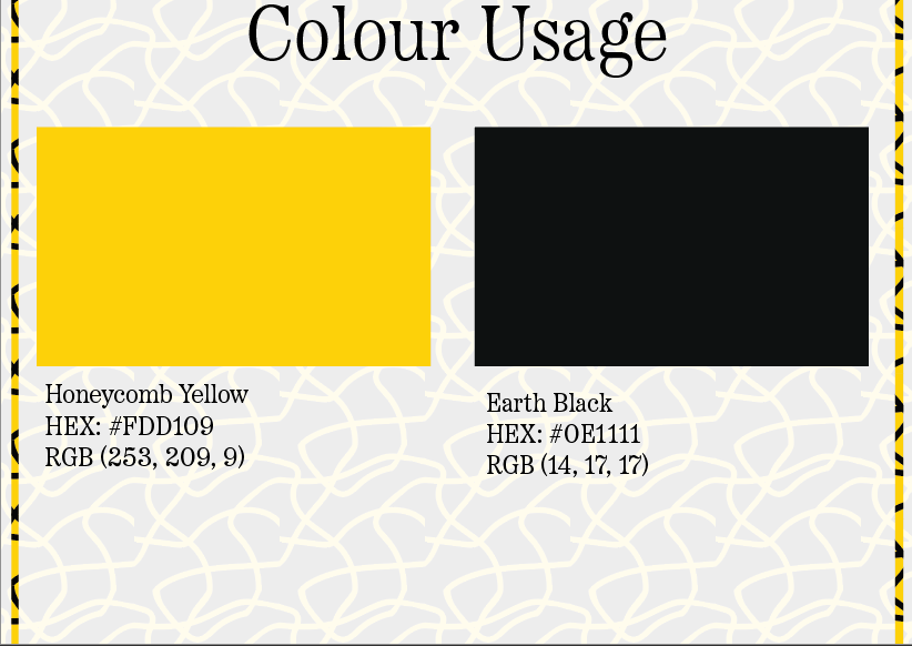
Colour Usage
My second slide is about colour usage, this is a short slide to provide the client with the HEX and RGB colour codes for each of the colours used. I decided to name the yellow I used “Honeycomb Yellow” to stick with the environmental theme, alongside this I used “Earth Black”. I didn’t use a pure black for this colour as I didn’t want there to be too harsh of a contrast on the viewers eyes when looking at the masthead or the pattern.
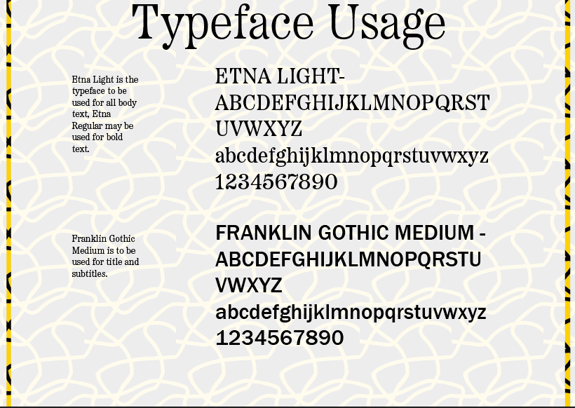
Typeface Usage
In my final slide I added a description about typeface usage. In body text use I used the “Etna Light” typeface. This is because it is the same type used in the masthead and by using the same typeface it subconsciously reminds the viewer of the masthead, making the masthead more memorable, it also adds a high quality but minimalist feel to the body text. An exception for this is to use “Etna Regular” for bold text which needs to be highlighted as important. However, I wanted the titles to stand out and contrast the other typefaces used, this made me choose “Franklin Gothic Medium”. This sans serif typeface is perfect for title as it’s thick and bold which helps it shine and create a focal point onto itself, it also contrasts the serif type which further highlights the title itself when surrounded by serif body text.