A responsive layout in UX/UI design is designing websites or apps to adjust automatically to different devices and screen sizes. This means that users receive a positive experience whether they’re using a computer or phone.
Responsive layouts will cause the layout to shorten whilst keeping accessibility to the maximum for the user. This means that groups and the elements inside them will shorten in width to accommodate for the lesser space on mobile devices in contrast to desktop screens.
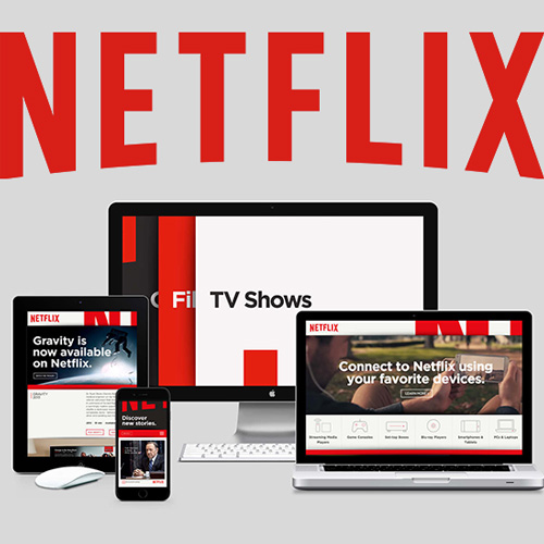
Here is an example from Netflix, on the right hand side there is a clear and visible stretched banner along the screen with the text being centred and a band of icons underneath, however on the tablet the title turns to be left aligned to create space for the image on the right hand side. On the mobile phone the title is still left aligned, however the image behind is removed and instead had a rounded square image underneath the title banner.
Practice
In preparation for the high-fidelity prototype a mock-up responsive layout example has been created, however this is not the final version that will be seen inside the app or the website prototype.
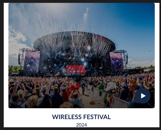
This desktop prototype features a image of the festival which is a thumbnail for a playable video the users of the site will be able to click play on and experience, this also features a title with a year date underneath which is centred underneath the image.
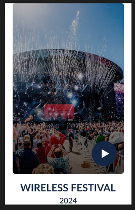
Here is the mobile version of the same layout which shows the same features such as the respective desktop version, however these elements are changed, the main video thumbnail itself is now shorter width wise whilst still leaving space on either side to create a less crowded feel on the page.
High-Fidelity Plan
In the next phase of the prototype the High-Fidelity version will feature a more refined version of this on a full website scale, allowing the whole page to scale between desktop and mobile layouts.