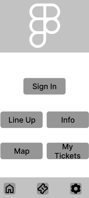
The homepage had a major overhaul, as the previous layout was “too plain” from survey reviews. The mid-fidelity version features an image at the top which will contain a white version of the wireless logo over it. The buttons have been rearranged with more leading between them to create more space and a more seamless layout. This layout has the sign in button at the centre which was missing from the low-fidelity version.
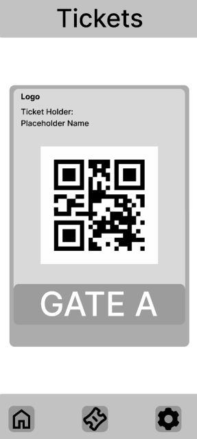
The ticket page also received an overhaul. This updated version now shows brought tickets once a member has logged in, this will make tickets more accessible for all users as they will not have to wait for a physical ticket/wristband to come through the mail which could potentially come with delays due to human error. This revamped version contains the QR code, name of user and gate which efficiently informs the user where to go. This will encourage users to download the app and keep it around for it’s efficiency.
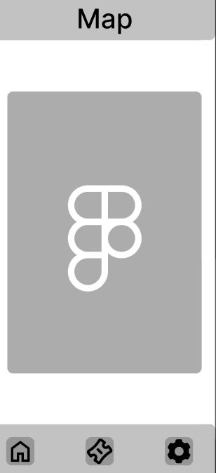
A new addition to the mid-fidelity app design is the inclusion of a map page, similarly to the website prototype, this page removes the info page as this can be easily integrated into the FAQ page instead, this change makes the app less crowded with pages which include mass text and creates space for the interactive map which will help users plan out their day and where to access key areas during the festival.
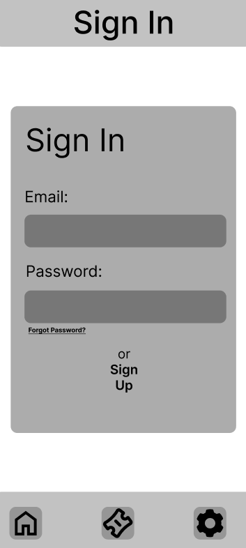
The sign in page now has a smaller background box to create a more seamless space and has now included a “sign up” button at the bottom of the section, this is due to feedback saying that the button was missing from the low fidelity version of this design. There is also a forgot password button underneath the password space to allow users who may have forgot their password to reset and gain access to their account.
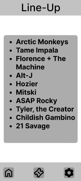
This is the line up page, this page will contain a graphic showing all the artists which’ll show up at the festival, this informs users and reminds them of who will attend, helping build excitement within the users. This version is more detailed in contrast to the low-fidelity version as it now contains actual text of potential artists which may be upcoming to the festival.
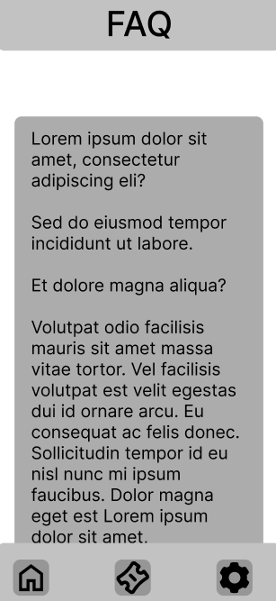
This FAQ page has been integrated with the info page, this is to contain the information into a smaller area and leave the app more space to breathe. This mid-fidelity version follows the trend of narrowing down the area in which the text resides in, this is to no overwhelm the viewer with long strings of text and allow for easier skimming and scanning for the user to find the relevant information they require.
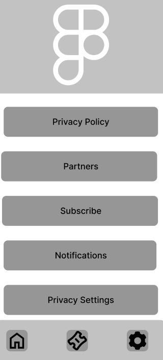
The app also includes a settings page, however the mid fidelity version has more spacing between the buttons, this is to keep the seamless feel through the app consistent. The large “Settings” title has also been removed as users will already know they’re in the settings page by pressing the “gear” icon on the reimagined navigation bar at the bottom of the screen which also features quick access to the home and ticket page.