Research
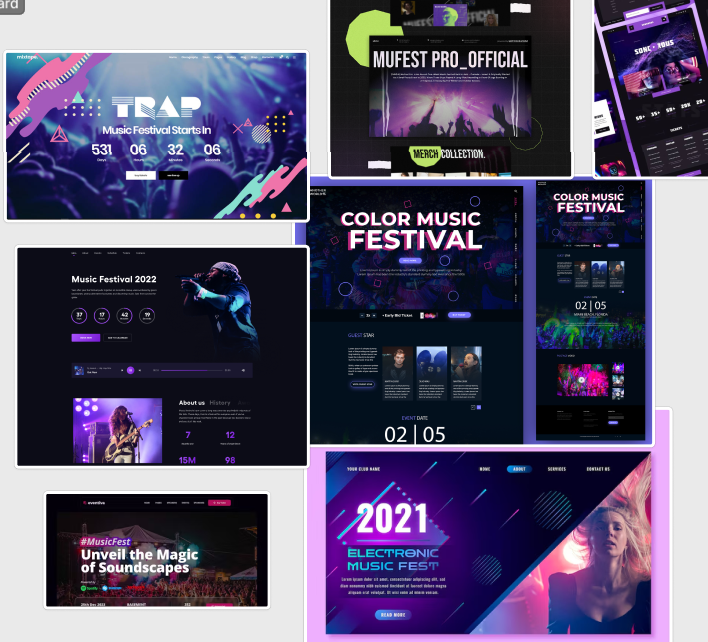
The research here shows varied music festival landing pages, there is a common trend amongst all of these landing pages with dark backgrounds which show bright and vibrant colours, such as neon titles, highlights and image. This can create a visually striking effect that catches the users attention and entices them to explore the website further as it reminds them of typical lazers or other lighting effects that appear at festivals. As this is the current trend in festival websites it’s clear that this sort of branding on the websites is successful at grasping the attention of the user.
Warning Signs
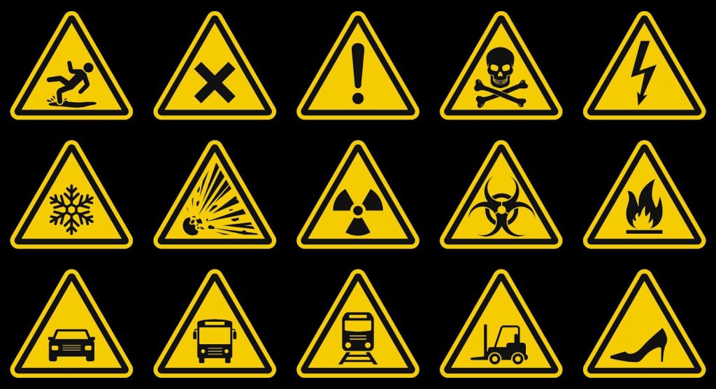
Warning signs use a black and yellow colour scheme, this is eye-grabbing because of its bright colours contrasting with black and how it is reminiscent of the natural world. Bees and wasps have yellow and black bodies to show how dangerous they are to predators and them to stay away. This applies to the human mind and ensures the brain takes notice of the sign.
High-Fidelity Colour Planning
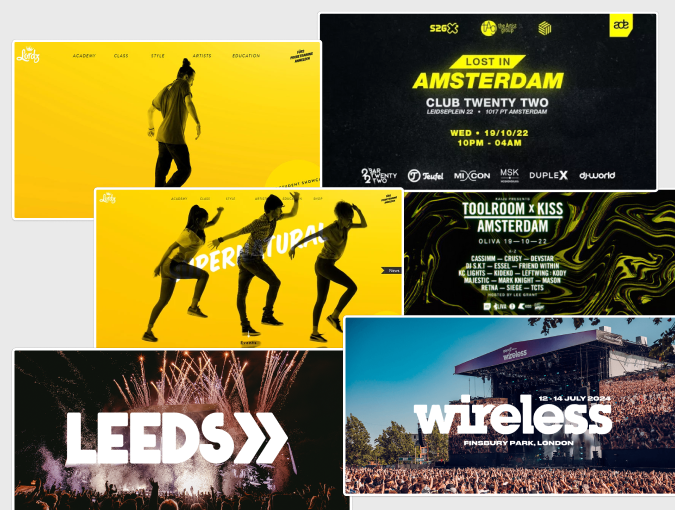
The mood board above depicts the atmosphere the high fidelity website and app will contain. From the research it shows that a dark black background paired with a bright neon colour is the current trend amongst the music festival websites, due to this further research showed the black and yellow is a niche yet effective colour choice combination which can pair white bold white titles as these work at the front of images.
Colour Palette
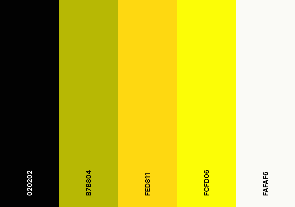
This is the chosen colour palette for the High Fidelity version of the website. This colour is highly attention grabbing and is capable of attracting the user with multiple ways this colour scheme can be used and adapted.
A bright yellow banner covering the right side of the website pages to instantly capture the attention of visitors. This banner will use black text to create a high contrast that with the yellow to ensure that readability is achieved for all users which will make the website more accessible and emphasizes important buttons such as the “tickets” button which will be in bold to further emphasise the importance.
The centre image/video which is prominent across the website and app will feature a black to transparent background from the bottom going up, this will help with the transition from a black background onto a image and help maintain a professional and seamless look throughout the design.
Buttons will have hover effects such as enlargement, this is to bring life to the website as a reactive website is much more engaging to the user which’ll increase the amount of time they spend on it which may potentially increase views.
Headings and icons will also contain bright yellow colour to maintain a established look across the whole brand, this means that users will easily associate the colour combination with the Wireless brand. It will also bring further attention to important titles that the user may find useful.
The contrast between black and yellow is crucial and beneficial to the wireless brand as it helps users who may be visually impaired navigate the website more easily. ensuring that the text and interactive elements such as the navigation bar on the right hand side are clearly visible against the background the colour scheme makes the website more user-friendly and welcoming to everyone successfully.