Competitor Research
My first step in creating my design was studying competitor research, this is due to it being the next step in the design cycle after reading the brief as Benz, M (2018) states “Learning about the market, competitors, and the people consuming your design will make your job much easier.”
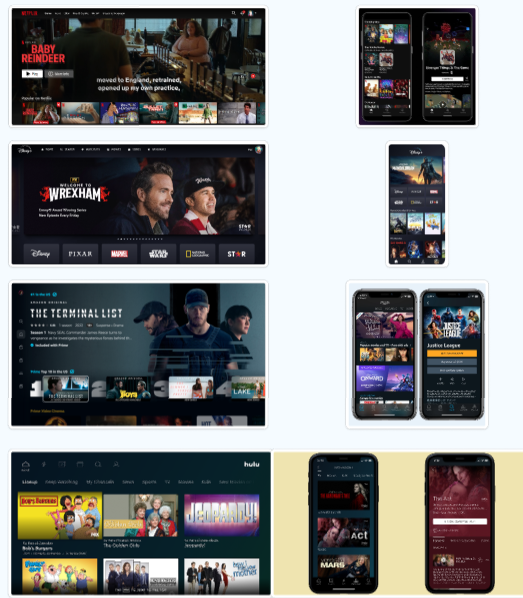
There competitor research here shows Netflix, Disney +, Amazon Prime Video and Hulu websites and their respective app versions. The research here shows that big billboard advertisements for trending shows on the website versions. This effectively captures the viewers interests, especially when combined with an auto playing video, which makes the website feel more interactive and alive. The only exception to this is Hulu which favours multiple title cards. The phone variants are similar to one another, all favouring title cards with Hulu and Amazon Prime Video favouring horizontal title cards.
Mood Board
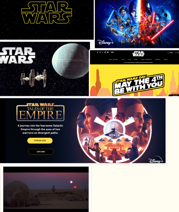
The app is going to be Star Wars based which is why I collated Star Wars images, the app will be heavily influenced by existing Star Wars media such as posters and websites.
Colour and Style
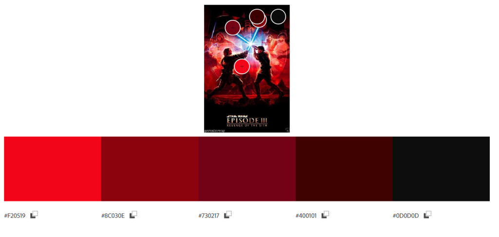
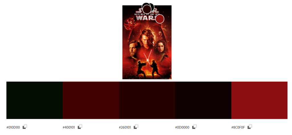
The colour and style for the app and website is going to be inspired from the existing Star Wars website and Star Wars movie posters. I decided to go for a deep and dark colour scheme with brighter red for “on click” effects on buttons.
Personas
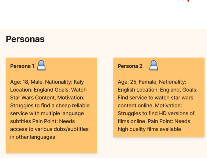
The personas for this app have two diverse problems for the website. Persona 1 is looking for a website which has various languages available for the user due to other streaming services not having languages other than English available. However Persona 2 is looking for high definition versions of the star wars film and series online for a cheap price.
Post 2: User Flow and U.I Wireframing
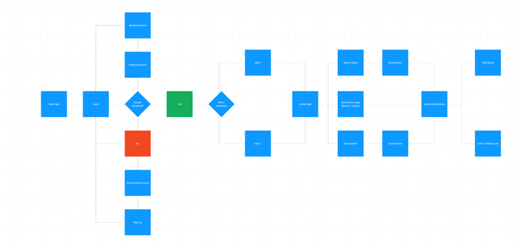
User Flow
https://www.figma.com/board/p16So7tQy52hkR8s1xiJfn/Dan’s-Research?node-id=0%3A1&t=SgOVzuWQ7piDXMjM-1
Here is the user flow for the app, it is similar to mother streaming services such as Netflix, Amazon Prime Video and Hulu. It starts with the log in page which then leads onto the question “correct password?”. If the answer is incorrect it will lead the user back to the log in page with an alert that the password is incorrect. If the password is correct this then leads to the “who’s watching” page which has various user profiles available depending on how many the user on the account wishes to create. After the user selects the wanted profile the app will navigate to the home page where the user will be able to access various film, series or genre sections.
Wireframing
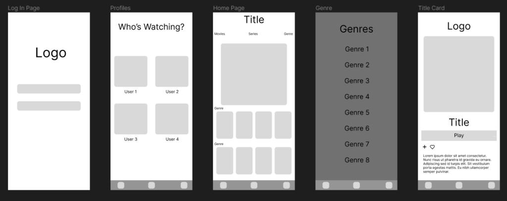
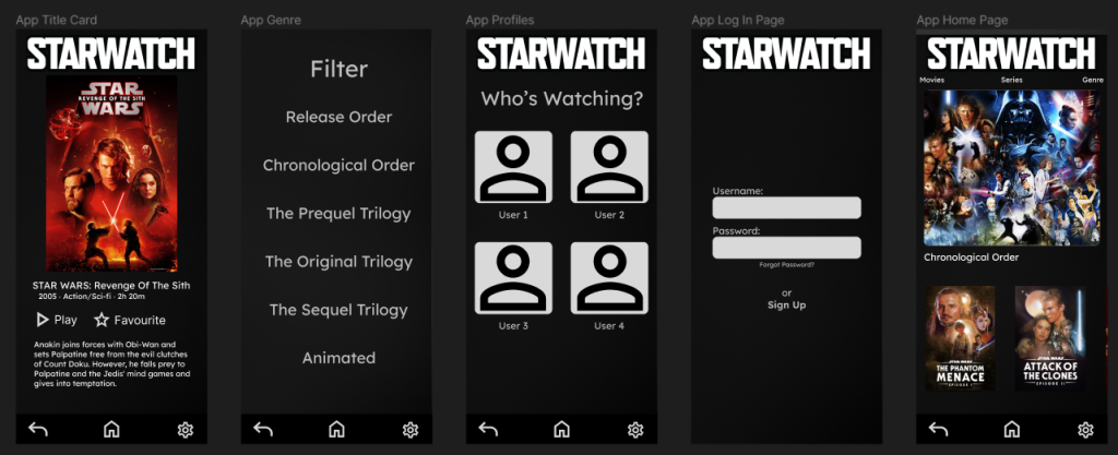
Here are the developed wireframes for the app. On the far left side is the log in page which the user would see when they open the app. It will be a minimal design to bring focus and attention onto the logo and instructions on the page, the username and password section being within thumb reach for left and right handed users for a smoother user experience. The next frame shows the next page that the app would open after a successful log in/ account creation. The “Who’s Watching?” page, this page showcases how the app would look like with four profiles as this is the most common amount of profiles for a traditional nuclear family. After a profile is selected the home page is then shown to the selected user, which will contain a large banner at the top advertising a movie/series, underneath that will be sections of different genres/filters. If a user wants to find specific films easier then tapping on the genre button will lead them onto the genre list page, this page contains multiple filters they can apply to search for specific types of movies/series. Lastly is the selected title page where the selected movie will be displayed, showing the runtime, genre and a short description.
Post 3: Adapting Your Design for Web Deployment
Responsive Attempt
I began with the title card desktop version and followed a figma tutorial online on making the page responsive, this worked fine with the movie image as the image scales to a bigger and smaller size for all of the app/tablet and desktop variants, however I couldn’t get the text to work the same as the image. This led me to creating three separate instances with a mobile version, tablet version and desktop version.
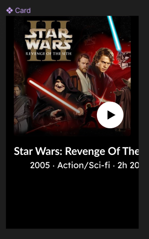
Rejected Design
This was the first mobile attempt at the title page, I stuck to the dark, red and grey colour scheme inspired from the Star Wars posters in post 1. However this evidently wasn’t working as the grey caused the website to look aged and dull. This led to a revamped version.
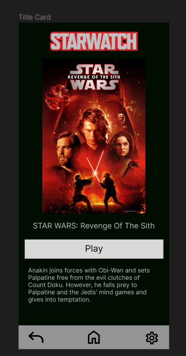
I went onto created a more black and white version reminiscent of space and the stars. This is also inspired by the Star Wars Website which also uses a large amount of black and white.
Final Versions
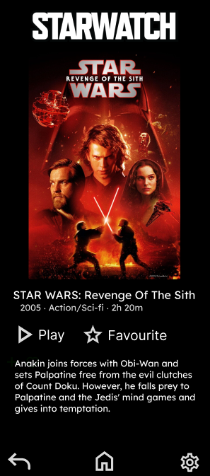
This is the final mobile set of designs. I changed the background on all of the pages with an animated white to black gradient to match the star theme but at the same time get rid of the boring plain black background. However I added a black rectangle at 70% opacity to stop the animated background from being too distracting from the on screen content and to prevent the white gradient areas with clashing onto the white text. I also changed the logo to be black and white instead of the red/grey previous colour scheme as this was better suited with the corporate identity. I also went with the typeface “Lexend” as this sans serif typeface was better suited for the “Star Wars” theme.
Post 4: Adapting Your Design for Web Deployment
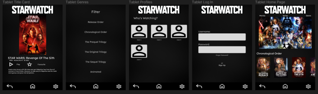
The app adaptation had minor changes to its key features across all of the pages that are present inside it’s design. For example in the title page the text is larger to accommodate for the larger amount of space to fill but to also increase legibility for users as small text on bigger screens will be hard to read. There is also bigger buttons for easier access to other pages and less movement required for the user using the tablet. Images used on the home page have also been scaled up for clearer visuals for all users.
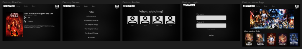
The final desktop variant has more visual changes in contrast to the previous two sets of designs. The desktop version has the navigation bar at the bottom removed, this has been replaced with the brand logo and buttons alongside it on the top of the screen for easy and clear access for the user accessing the service. The title page has change to a different layout due to the orientation switching from portrait to horizontal. This led to the poster image taking up the left side for a clear view of the selected movie and all of the text being staggered along the right hand side. Again the Home screen has also had all of the images upscaled to accommodate for the extra space available in the design.
https://www.figma.com/board/p16So7tQy52hkR8s1xiJfn/Dan’s-Research?node-id=0%3A1&t=SgOVzuWQ7piDXMjM-1
References
Benz, M. (2018) 9 Effective Ways To Optimize The Graphic Design Process | Filestage. The Project Success Blog. Available online: https://filestage.io/blog/graphic-design-process/.
All Images Obtained From: https://www.starwars.com/ and https://www.disneyplus.com/home Accessed 11/05/2024
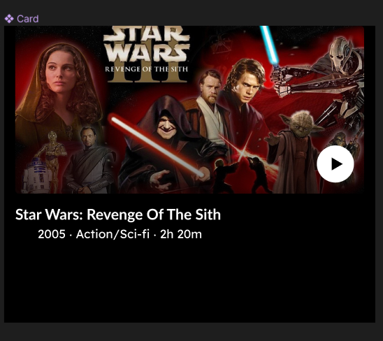
Star Wars: Revenge Of The Sith Movie Description Obtained From https://en.wikipedia.org/wiki/Star_Wars:_Episode_III_%E2%80%93_Revenge_of_the_Sith Accessed 11/05/2024