Branding
After researching various venues and talking with classmates about their venue ideas, I decided to make my venue a Roman Museum. The main inspiration for this decision was Asterix & Obelix which is a comic/film series about a Gaulish village which resists Julius Caesar’s Roman army thanks to a magic potion.
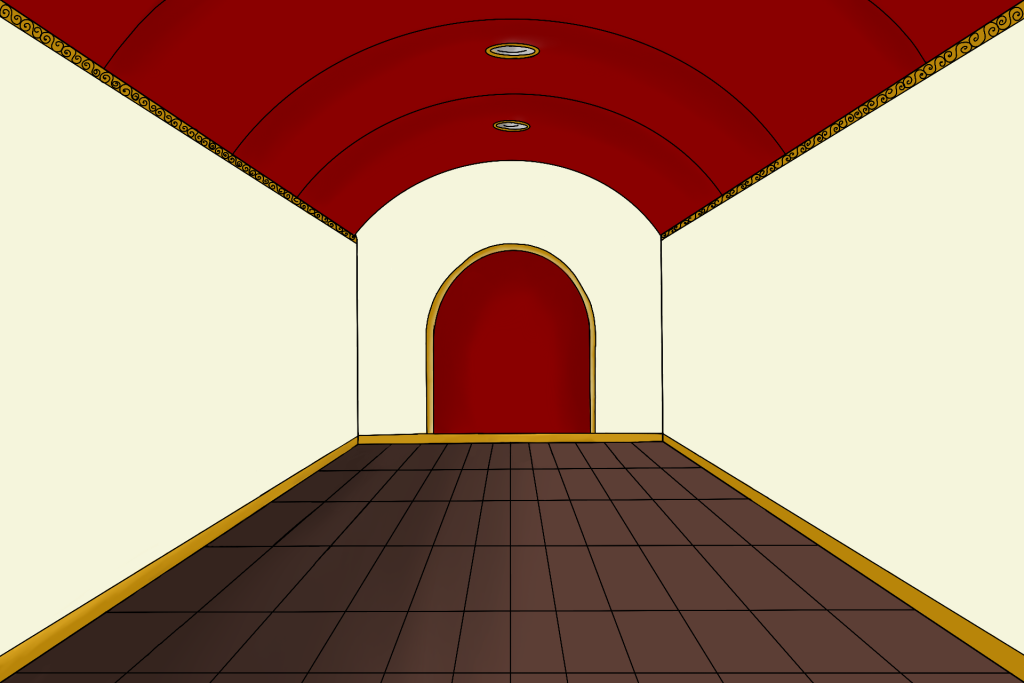
This is the Hull Museum logo. I created a large H using Roman Pantheon pillars, this is to hint at it’s roman specific focus within the museum. I also chose the colours based off of a Roman colour palette. This is the logo that will be used for the Task 1 animated logo intro. In Roman mythology this colour represented blood and courage, worn by the Roman army as it was also the colour of the Roman god of war, Mars. Jeffries, S. (2015). This led me to create the first ask as an interior of the museum showcasing potential items that may be shown inside the museum to capture the interest of adults. However the animation includes items falling over causing destruction in a Looney Toons fashion to also capture the attention of younger potential customers.
Task 1 Animation
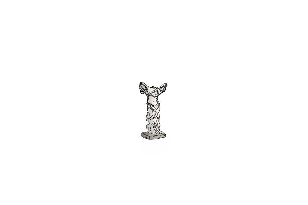
Here is my final museum animation. At the beginning I used the two pillars I created earlier to form the “H” in the Hull Museum logo. These two roman pillars hit each other before coming to a standstill in the centre of the screen, after this a coloured block joins up the two pillars forming the “H”, which happens whilst “Hull Museum” appears underneath. I then used the Alpha Colour Effect to make this first intro sequence disappear and the next scene appear behind it. This shows a scene of the interior of the museum, which was all drawn on Procreate on separate layers which allowed me to manipulate the objects shown in the scene. Inside the scene we see a pillar wobbly which causes a chain reaction of destruction inside the museum, after a brief pause the scene slowly restores itself back to it’s original position meaning the scene can be looped.


All drawn assets were drawn at double the scale of the canvas used in animate in case some object needed to be enlarged to prevent pixelation.
What I learned
Although I really struggled with animate at the beginning and found it overwhelming as I dove headfirst trying to work from memory of what I learnt in class sessions, I eventually conquered Animate by rewatching the tutorials and personal trial and error whilst experimenting with different effects. This task me taught me the importance of setting up keyframes properly to ensure that positioning and chosen colour effects don’t play too early.
Task 2
I planned to continue my theme of the interior of the museum for task 2. This is as there is not much areas to show in a museum other than the exhibitions, however this one was purely art focused to make it different from task 1 which included pillars and a statue. I ended up with a close up of a wall which has three large frames on it with three plaques with text on them under each photo. However the text will be unreadable until it is clicked where an animation will then play enlarging the plaque and making the text visible to the viewer.
I learned a lot from Task 2, especially after running into a few annoying problems. The main issue was that I kept forgetting to give my symbols instance names, which meant the web animation didn’t work at all. It was super frustrating and I had to go back through the tutorial a few times trying to figure out what I was doing wrong. After some messing around and experimenting, I fixed it and everything came together and I was able to finish the animation easily. By the end, I felt confident using the Actions tool properly. I wasn’t just clicking through menus anymore but I also learned the keyboard shortcuts. Overall, even though it was rough at first, I came out of it with a way better understanding of how it all works and how to avoid the same mistakes in the future.
Task 3
For Task 3, I created a mobile animation that features a simple layout with an interactive button. The animation starts with a soft yellowish background that sticks to the brand’s colour palette, giving it a warm and inviting feel. On each side of the screen, there are two matching pillars that help frame the scene and add a bit of structure. From the top centre, the museum’s logo smoothly drops down, creating a nice focal point. After that, an image of the museum’s interior fades in to give a preview of what visitors can expect. Near the bottom of the screen, a button gently floats upward, grabbing the viewer’s attention. When the button is tapped, it triggers an animation where a rectangle with some text slides out and expands across the entire width of the screen. This section displays extra info about the museum for customers to read.
Task 3 really helped me refine my skills, especially when it came to using the Actions panel to create buttons and set up animations that play when they’re clicked. I did this task with less errors as I didn’t forget to add instance names to my symbols this time. I used Actions in task 2, but this task pushed me to get more comfortable with it. I got better at fixing small issues that popped up along the way. Overall, Task 3 was great for refining my skills, not just in interactivity and animation, but in getting more efficient and confident using Adobe Animate as a whole.
References
Jeffries, S. (2015) Why red is the oldest colour. The Guardian. Available at: https://www.theguardian.com/lifeandstyle/2015/sep/01/why-red-is-the-oldest-colour#:~:text=Unsurprisingly%2C%20red%20appears%20as%20a,gladiators%20were%20adorned%20in%20red. (Accessed: 8 May 2025).