Early design prototyping
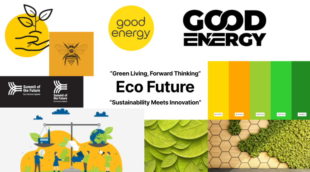
My Eco-Future mood board using green and yellow to show sustainability, innovation, and optimism. Green represents nature, growth, and eco-consciousness, while yellow symbolises energy, light, and a bright future. The mood board feature lush green leaves, textures like leaves and wood. Bold fonts and minimalist logomarks to show a clear message to the clients.
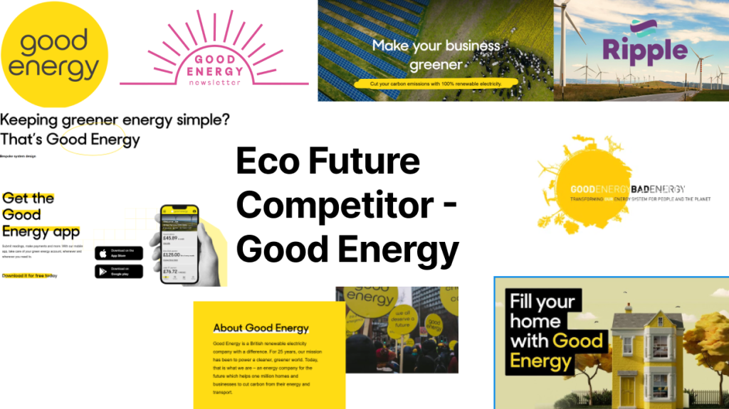
I made a another mood board looking at competitors, it is based around bright yellow tones, symbolising sunlight, energy, and positivity. The imagery they use focuses on wind turbines to promote innovation and sustainability. Yellow dominates the palette, creating a warm and optimistic vibe, whilst relating to solar energy to tie into the overall brand as solar energy is also considered “good energy”.
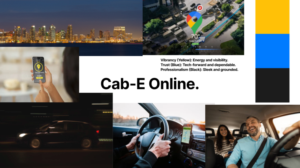
The second mood board is a Cab-E mood board it has visuals that show the essence of modern online taxi services. Using mainly hues of yellow and black, inspired by traditional taxi colours, it shows energy, speed, and reliability. Using a blue accent to use in places such a call to actions. The imagery features sleek, modern cars, cityscapes, and maps symbolising navigation. Icons like location pins, route lines, and smartphones emphasise the app-driven experience. The mood board shows a service that’s fast, efficient, and customer-focused, reflecting the convenience and accessibility of Cab-E.
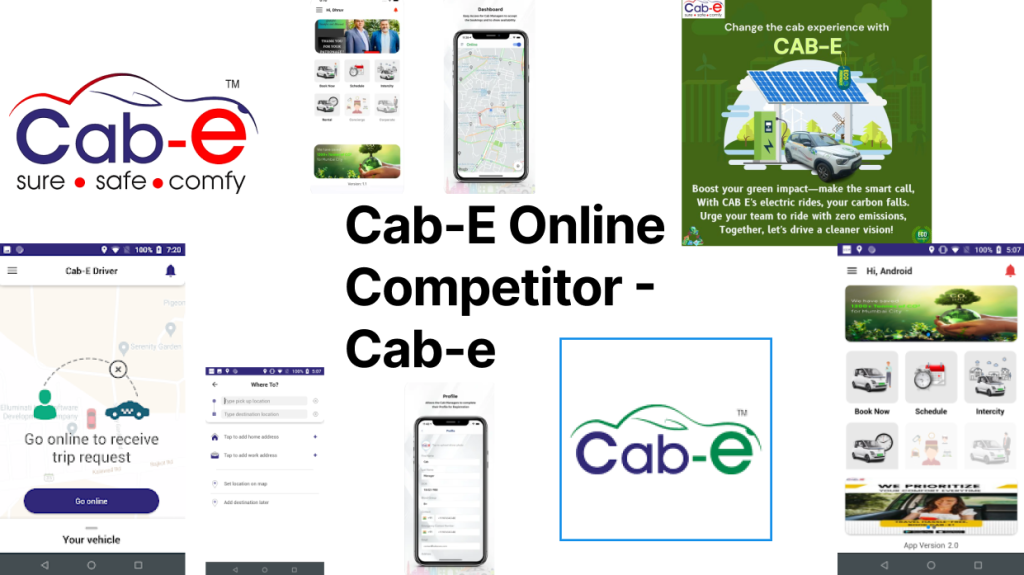
I made another competitor mood board for Cab-e which is a competitor with the same name. This mood board also consists of imagery of taxi cars and navigations maps to convey a modern taxi service. It also uses green and red colours to convey sustainability and eco-friendliness alongside urgency and fast service.
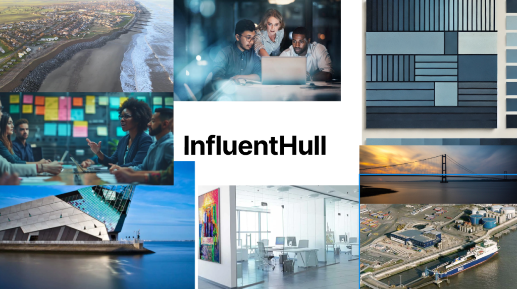
The InfluentHull mood board combines professionalism, innovation, and a strong sense of place. Using deep blue hues, to convey trust, stability, and Hull’s heritage. Imagery includes corporate professionals, symbolising collaboration and expertise, alongside sleek office spaces to reflect modernity. Highlighting the company’s connection to Hull, imagery features The Deep Aquarium, adding a local touch. Clean, bold typography would be used to reinforce professionalism, while blue accents show the company’s energy and local pride, creating a modern, place-driven identity.
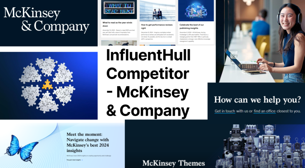
InfluentHull’s competitor mood board is similar to InfluentHull with it’s blue vibrant hues to reflect trust and stability. However instead of bold typography it uses a clean serif typeface, symbolising tradition, authority, and expertise. Paired with a muted colour blue palette such as navy blues and whites, to convey a sense of sophistication and reliability. Imagery also includes corporate professionals which again symbolises expertise inside the brand. All imagery for for mood boards was sourced from google images.
Logo

The first Eco-Future logo is a modern design that shows sustainability and connection. The brand name is shown in a bold, sans-serif typography, emphasising strength and clarity. The key feature is the letter “O” in “Eco” which is turned into a filled light green circle to symbolise the Earth and the brand’s sustainability. Inside the circle, two minimalist leaves curve upward, representing growth and harmony with nature.
A dash connects the “O” to the word “Future” through a green line, symbolising the connection between sustainability and progress. This line physically links the “O” and the “Future” text where they touch, creating a metaphor for the brand’s mission of bridging eco-friendly solutions with users lives. The connection also shows the brand’s commitment to creating an interconnected, green future.
The use of green tones throughout the logo reinforces the eco focus, with the light green in the circle and leaves paired with a slightly darker green for the connecting line, adding depth and balance. The clean, bold font enhances readability and shows innovation and reliability, making the logo adaptable across both digital and physical mediums.
Overall, the first Eco-Future logo captures the essence of sustainability, growth, and connection, providing a memorable visual identity that aligns with the brand’s mission.
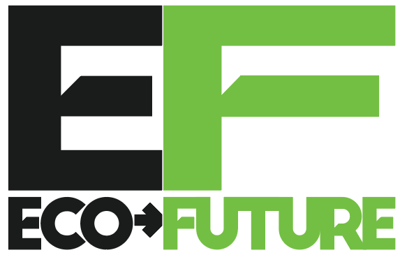
The second Eco-Future logo is structured around two key elements: the bold “E F” lettering and the “eco-future” text. The “E” is presented in black, symbolising professionalism and strength while the “F” is in a vibrant green, representing nature, growth, and sustainability. This contrast between black and green creates a balance that reflects the connection between technology and the environment.
Below the “E F” letters, the brand name “eco-future” is shown in clean, sans-serif text, emphasising a modern design. The word “eco” is in black while “future” is in the light green colour , creating a seamless flow of sustainability. A small black arrow connects “eco” to “future,” symbolising the brand’s progress to creating a sustainable future.
The typography is bold yet simple creating clarity across various mediums, from digital platforms to physical branding such as letterheads. The use of contrasting colours, visually shows Eco-Future’s mission of environmental sustainability while showing innovation, creating sense of trust and connection.

The final and chosen Eco-Future logo is a clean and modern design that effectively shows the brand’s focus on sustainability and energy innovation. It integrates the word “eco-future” within the outline of a battery, symbolising renewable energy and technological progress. The battery shape, in light green, focuses on eco-friendliness and the brand’s commitment to sustainability. The battery moves to the right side to showcase the brand moving to a green future.
The word “eco” is styled in black sans-serif type, showing strength, reliability, and professionalism. In contrast, “future” is in light green, similarly to the battery’s colour to show growth, renewal, and sustainability. The use of lowercase letters creates an approachable feel, making the logo inviting and easy to read.
The placement of “eco-future” within the battery outline creates a connection with the brands name and its mission to provide sustainable energy. The logo’s minimalist design ensures it’s readability in digital and physical platforms.
This design shows a strong and positive message about powering the future through green energy and shows the brands commitment to creating sustainability in the world.
Wireframe prototyping (Figma/Adobe XD/PenPot)
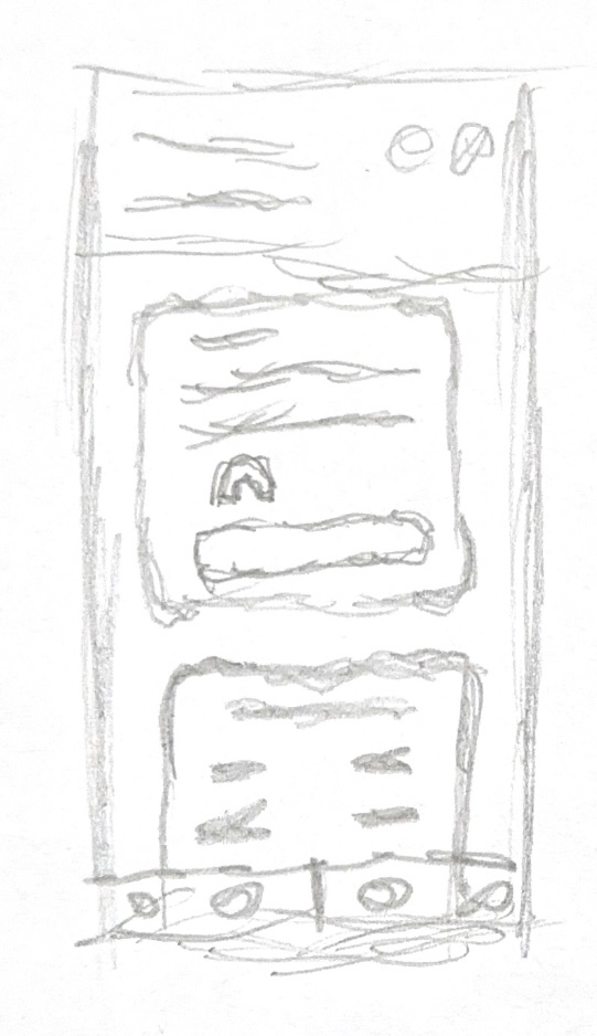
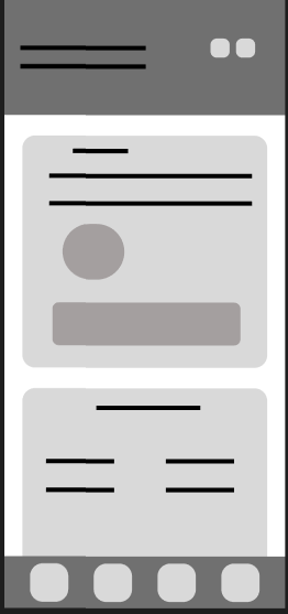
The first wireframe for the Eco-Future app wireframe shows four buttons at the bottom for easy thumb accessibility. This variant uses the home page to show the app user their energy savings after signing up with the company and installing solar panels for example. Below that is another section where the user would be able to see further detailed information about their energy uses. The very top section features a button for a dark mode for visually impaired users alongside a back button on the right hand side as most phone users are right handed.
The layout prioritises simplicity and usability, with distinct sections that allow users to quickly navigate through information and features. This is the reasoning for important information being on the home page instead of a “welcome page” where the user would then choose where to go within the app next.
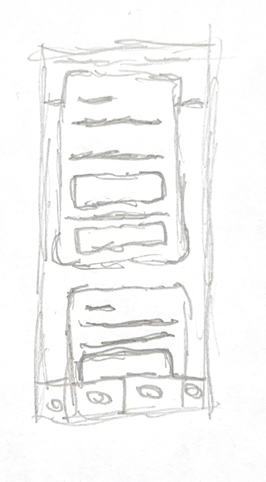
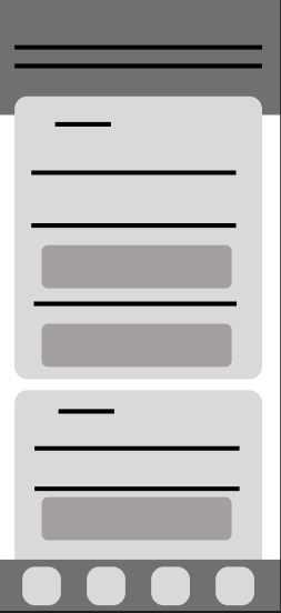
The second wireframe contains a more simplified layout in comparison to the first wireframe. this is due to the target audience of an energy company is for adults, which may struggle with overcomplicated apps, which means that simplicity is key. This further aligns with the brands ideals of simplicity and related back to the simple logo the “Eco-Future” has. This wireframe contains two cards which both will show information relating to energy savings since signing up with the company.
Again the bottom uses four navigations buttons for easy thumb access for both left and right handed people, this version doesn’t have the top buttons as upon reflection they may have been harder to reach so the dark mode would have been moved to the “settings” page within the app, there may also be a pop up upon the apps first launch asking the user to set their preference to “light mode”, “dark mode” or “match device settings”.
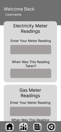
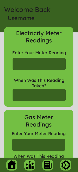
Here is the mid fidelity version which shows more clarity on how the “Eco-Future” app would operate. The top bar has a “Welcome back” text with the users name underneath after the sign-up to the app is complete. This is to make the app more personalised to the user and align with “Eco-Futures” brand mission of a friendlier more sustainable future.
The first card shows the user their electricity meter reading where they will input their reading alongside with when the reading was taken, this would then calculate the amount of money they have saved by signing up with “Eco-Future”. This is then repeated below for gas meter readings to show the user how much using gas appliances costs them and encourage to switching to more electric appliances. This switch would tie into the user wanting to have solar panels fitted from “Eco-Future”, helping the brand expand and achieve it’s mission of a more sustainable future.
The bar below has four main navigation settings. The first being a home icon to go back to the home page from wherever the user is within the app, this again ties in to easy accessibility for the elder users that may be using the app. The second is a chart page where more in depth information about their energy usage can be found, this is a sub page to again tie into the accessibility and easy understanding of the app for elderly users. The third icon is a FAQ page where users can find frequently asked questions to find their own solutions to common questions instead of having to ring/email the company. The fourth and last icon is a settings page where the user will find all of the settings such as a dark mode if they wish to change their preferences.
Banners (Adobe Illustrator/Photoshop/Adobe Express)

This is the “Eco-Future” mobile advert. This advert uses a symmetrical image in the background of a field with blue skies and clouds alongside with turbines hugged the “Eco-Future” logo in the centre. This design has text on both the left and right hand side encouraging users to switch to a greener energy provider, aligning with “Eco-Futures” mission of creating a more sustainable future. On the right hand side is a tag line “Shaping Tomorrow, Naturally” this shows the viewer that Eco-Future is changing the future naturally, a play on words as the use of “naturally” links into restoring nature but also links into how this process comes easily to “Eco-Future. These outer text parts are featured in a darker area, which was darkened in photoshop, to show the effect that “Eco-Future” is brightening up the future with it’s sustainable energy.

This is the “Eco-Future” skyscraper advert. This advert uses a symmetrical image in the background again to follow through with a consistent advertising theme. This design however has the text going from the top to bottom due to it being vertical. This again features text on the top encouraging users to join “Eco-Future” and it’s mission for greener energy, whilst the text at the bottom of the advertisement features the brands tagline, “Shaping Tomorrow, Naturally”. This again is shown in a darker area which has been darkened in photoshop to show the lighter area behind “Eco-Futures” logo.

The final advertisement for “Eco-Future” is the rectangle advertisement. This similarly to the mobile advertisement features a greenfield with blue skies and wind turbines. This imagery has again been reflected in photoshop to create a symmetrical image as a background to represent balance and harmony which is “Eco-Futures” brand mission to restore. This advertisement also features a white shining light area behind “Eco-Future” to represent the brighter future it brings to the viewer. Underneath, following a hierarchal format, is the call to action text which encourages the user to switch to “Eco-Futures” more greener energy. Underneath in the smaller text is “Shaping Tomorrow, Naturally” which again further references the greener future that “Eco-Future” is going to provide to the user if they choose to sign up to the brand.
Online video advertising (Adobe After-Effects/Premiere Pro)
This is the first Instagram reel that will be featured on “Eco-Futures” social media page. This reel shows the customers four ways that switching to “Eco-Future” can help the user and the world by switching to greener energy. Examples of these points include offering programs to users or installation of solar panels on the users roofs. This educational text is in the iconic green that “Eco-Future” sports on their logo to further tie in that this is an “Eco-Future” brand Instagram reel and makes the brand more recognisable through the repetition of it’s brand colour.
The background videos which are sourced from pexels, feature videos such as the earth spinning, reminding the viewer of the planet that they are on and that it needs to be cared after through green energy, fields of solar panel to encourage the viewer to install their own solar panels through “Eco-Future” and save energy costs whilst also helping save the planet. There is also charts which show monthly temperatures relating to the smart thermostat installation service that “Eco-Future” provides.
This second “Eco-Future” Instagram reel is an educational reel of the positive effects of solar panels. Some of these positive effects include Reduced Energy Costs, Environmental Benefits, Energy Independence and Reliability. This informs viewers why solar energy is beneficial to them and to the world that they live in and encourages them to switch by joining up to “Eco-Future” as their logo is prominently shown at the top of the page. The videos in the background have been darkened to help the text contrasts due to their light green colour which follows the brand theme. The video footage has been sourced from Pexels again and shows various locations that feature solar panels further reinforcing the switch to solar energy to the viewer.
References
Pexels (2024) Solar panels on the rooftop of a building. Available at: https://www.pexels.com/video/solar-panels-on-the-rooftop-of-a-building-2836004/ (Accessed: 23 December 2024).
Pexels (2024) Solar panels as source of energy. Available at: https://www.pexels.com/video/solar-panels-as-source-of-energy-1276083/ (Accessed: 23 December 2024).
Pexels (2024) Aerial shot of forest. Available at: https://www.pexels.com/video/aerial-shot-of-forest-1168716/ (Accessed: 23 December 2024).
Pexels (2024) Wind mills and solar panels. Available at: https://www.pexels.com/video/wind-mills-and-solar-panels-9789926/ (Accessed: 23 December 2024).
Pexels (2024) Push-in shot of the Earth. Available at: https://www.pexels.com/video/push-in-shot-of-the-earth-10755267/ (Accessed: 23 December 2024).
Pexels (2024) Wind mills and solar panels. Available at: https://www.pexels.com/video/wind-mills-and-solar-panels-9789926/ (Accessed: 23 December 2024).