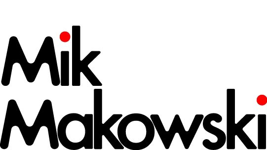
First Typographical Logo
For my first typographical logo I wanted a minimalist, soft feel. I created this effect by using one of my favourite fonts Futura, I then moved the lettering to be close and compact to each other, this was to create a more more cohesive and visually appealing design and for the logo to have a more modern touch despite using an older typeface. I then decided to modify the Future typeface by rounding all the edges of the typeface, this helped create a more friendly feel which represents my friendly personality. However I wanted a slight serious but simple and memorable feel to the logo so I decided to change the dots in side the “i” to red. I chose red as it is often used in art and various other media to represent courage, this suits me and my personality which makes it a fitting colour to subtly add onto my logo.
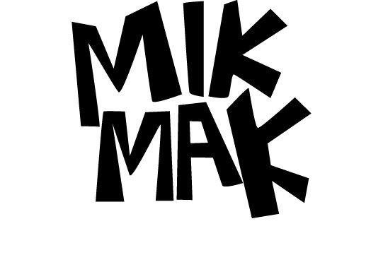
Second Typographical Logo
For my second logo I wanted a more bold and unique feel in comparison to my first attempt. After browsing through various typefaces I couldn’t find one that suited the look I was attempting to achieve, to overcome this issue I created my own type using the pen tool. I made unequal and exaggerated lettering of my full name, however due to my long full name I decided to change it “MIKMAK”. This gave it a more snappy and memorable name alongside the exaggerated lettering which represents the fact that nobody is perfect which is one of my beliefs. I tried different colour variations however none worked as well as the plain black logo, the black helps the logo maintain a serious and professional feeling to the logo. This clearly represents my serious and imperfect side in logo form whilst being memorable.