First Conceptual Logo
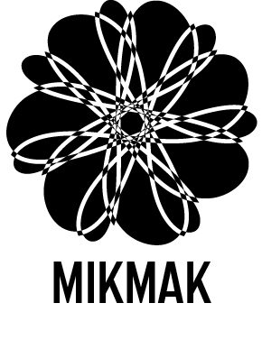
For my first conceptual logo I started with the idea of a flower. This was to represent my love for nature as i’m passionate about saving the environment and enjoy going on nature walks. My second idea for this logo was related to my interest in science as I spend some of my free time watching science related videos from youtube channels such as “Kurzgesagt”. The symbol I chose to represent the science interest is a Mobius Strip, the Mobius Strip is a object formed by using a strip and twisting one end through 180°, and then joining the ends. The Mobius Strip often represents infinity, I wanted to combine the ideas of infinity alongside nature and science,
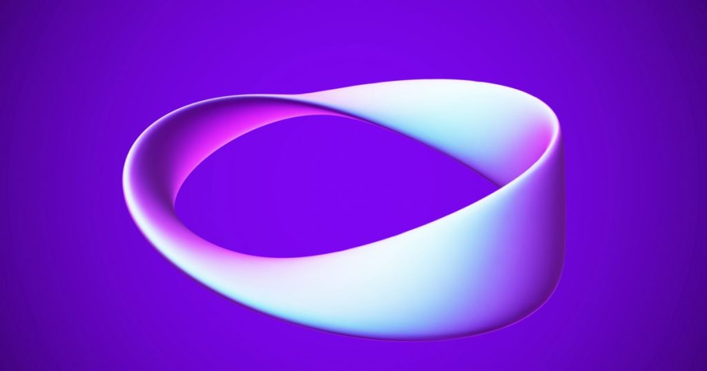
An example of a Mobius Strip
I first started by drawing a singular Mobius Strip, after trial and error I finally produced a shape I was happy with, I then duplicated and rotated the mobius strip until it looped back onto itself, this left me with a flower looking pattern which interlinks both of my ideas together. I used the pathfinder tool to trim the circle edges which left me with an interlinking flower created from multiple Mobius Strips, This logo uses the Mobius Strips inside the flower to show that the cycle of nature is infinite.
Second Conceptual Logo
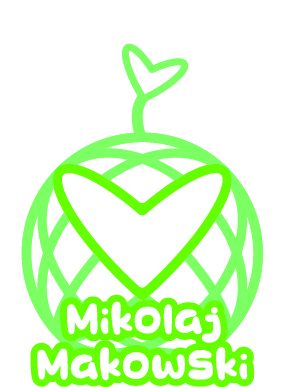
For my second conceptual logo I wanted to go for a more playful and friendly logo to contrast my first design. This logo represents connectivity and nature together. I did this by drawing a circle with overlapping curved lines, however after doing this I noticed a heart shape among the overlapping lines. Using the shape builder tool I created a heart into the centre, this heart represents my love for nature and the world. This is further represented by the light green colour scheme which also puts emphasis on the friendly aspect of the logo. I then used the same heart shape onto the top of the world with a small stem underneath to create a focal point at the top of the logo which would then lead the viewers eyes downward onto the large heart and my name. I chose a rounded sans serif typeface to upkeep the friendly feel of the logo.