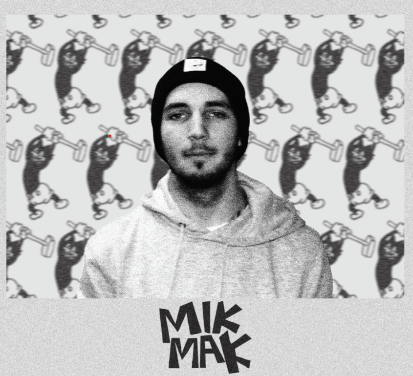
First Photoshop Portrait
For this Photoshop portrait I wanted to show of my love for tattoos as they’re important to me and have various meanings, some deeper than others. I started this by taking a photo of a tattoo on my arm and taking it into Photoshop making it black and white, I next took this into Illustrator and made it as a pattern. This gave me my background which shows off my favourite tattoo and reflects my easygoing personality. I decided to add a border and my logo to help create a focal point on my face. I was inspired from various pinterest posters whilst doing research and decided to add noise across the whole poster to add extra depth whilst creating a gritty/grungy atmosphere.
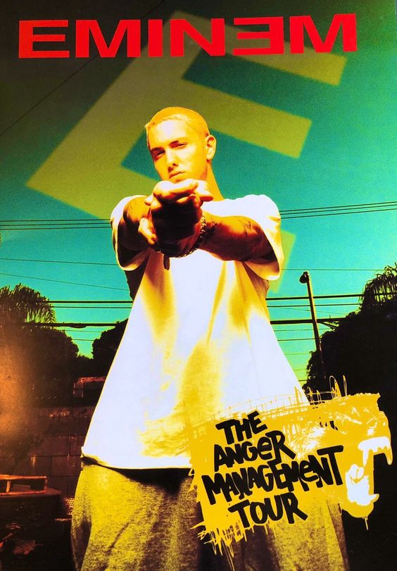
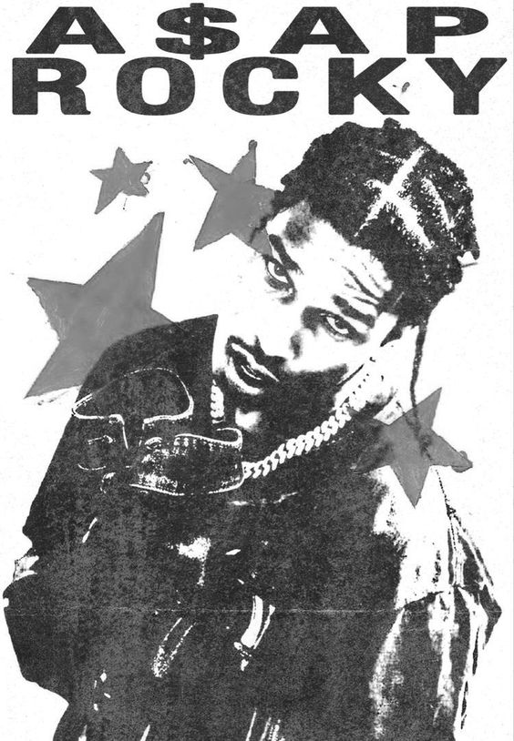
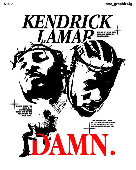
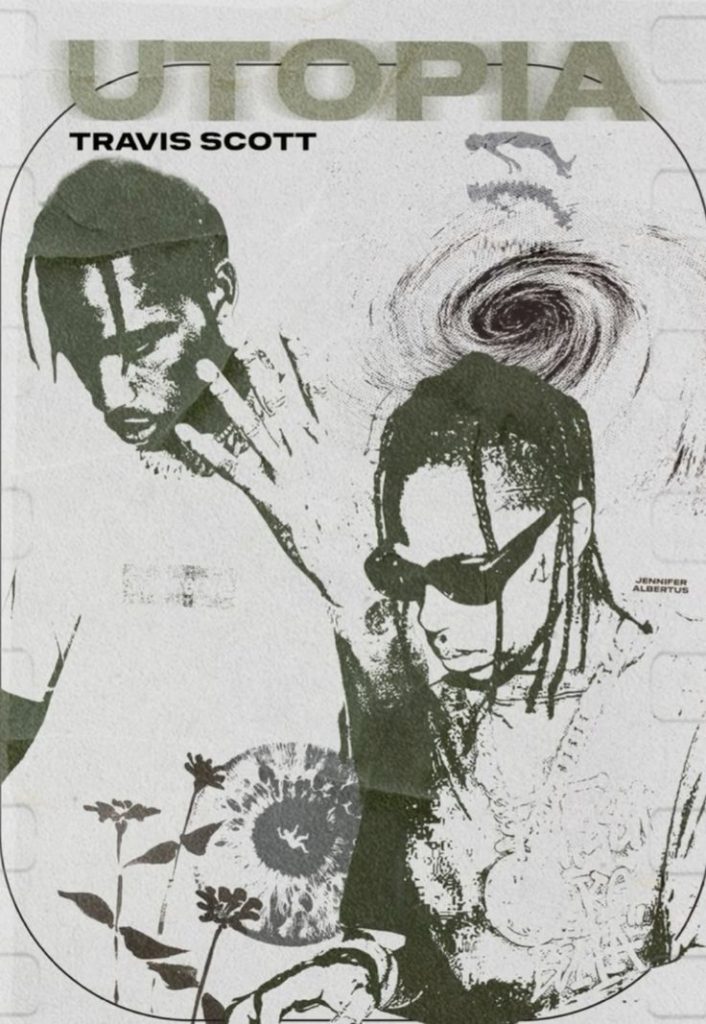
Pinterest Posters That Inspired Me
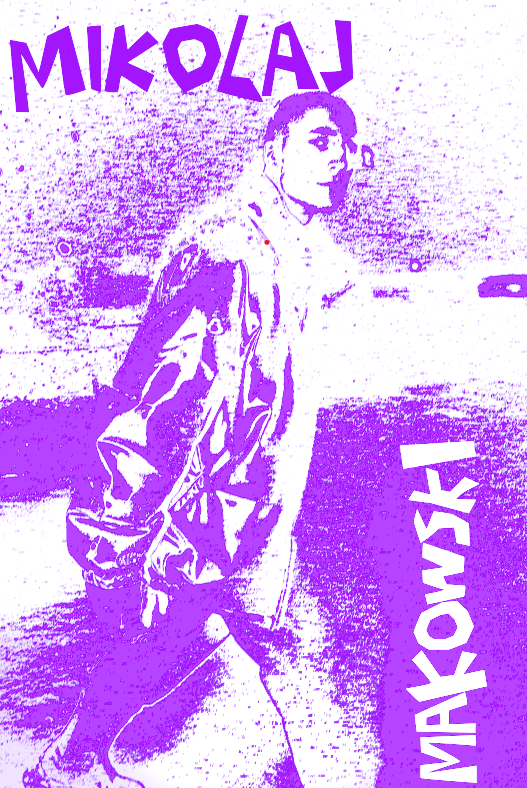
Second Photoshop Portrait
For my second poster I used a photograph of myself modelling outside in the snow, I’ve chosen this specific one as my favourite weather is when it is snowing, however I wanted to spice up the portrait and not just use a image. I started by applying a mezzotint filter and then a motion blur filter on top. This was to stop the poster from looking too flat. I added a gradient map onto the photograph, after looking through various colours I settled for for a white to purple gradient, this is due to purple symbolising loyalty and this is a trait that I have and something that I find extremely important in life, due to my belief that everyone should be loyal to something such as a person/ideology. Finally I added my full name in the exaggerated text on the very top and vertically on the side on the right, I purposefully used a strange composition with the text to represent that it’s okay to be unique and different, being like everybody else isn’t important.