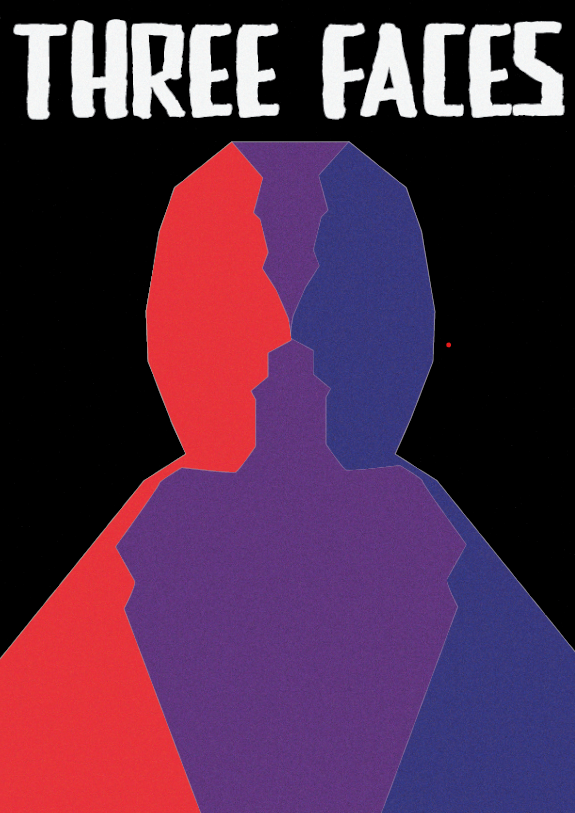
First Illustrator Portrait
My first portrait I started with outlining a photograph of myself, I first outlined a photograph of myself, I then placed a side profile photograph and flipped it after outlining the first side. I next lined up the line art to create one person out of three. Colour is a significant player in this, I decided to use black as the background colour as black is often used to signify nothingness, I used this to show that the outside doesn’t matter only what’s inside a person does. This is why I decided to use the three colours red, blue and purple on the inside of my work. The three faces inside the person represent the three faces that everyone has. The first face (red) is the one you show to strangers and colleagues, the second face (blue) is the face you show to family and friends and lastly the third face (purple) is the face you show yourself, this is why the purple takes up the centre and forms a heart on the torso of the whole outlined person.
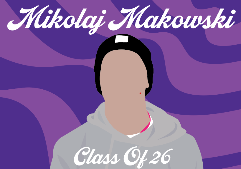
Second Illustrator Portrait
For my second poster I decided to outline a photograph of myself, and filled it in a solid skin colour, I repeated this process for seperate areas of myself such the hoodie, shirt, lanyard, beanie and shadows. I tried to do this in a style inspired by artist Rafael Barletta who I found whilst doing research for various portrait styles on Pinterest. After I was done with the portrait itself I wanted to show off my interest in 70s music, to do this I researched various 70s disco patterns and after deciding on the wavy background I created my own with two shades of purple as this is my favourite colour. However this left the poster with too much leading at the top and bottom so I added the text which includes my name and graduation year, I looked for a 70s swirling typeface to match the background and further emphasise my interest in 70s music.