First Self Promotion Poster
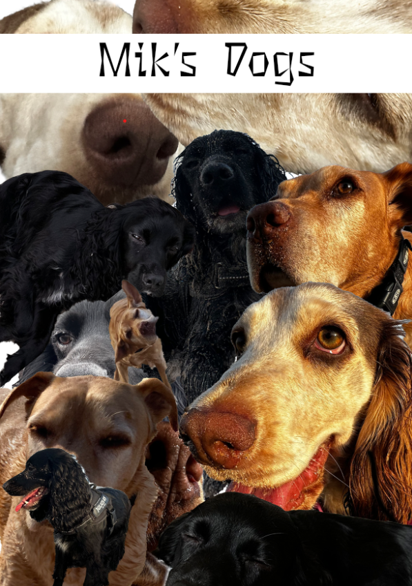
I wanted my first poster to represent my love for animals, I couldn’t find a better way to do this than using my own photographs of all three of my dogs. I started this by finding photograph I had taken myself of my dogs whilst I was on holiday in Scotland. I chose various photographs ranging from front facing photographs to side angled ones to create a more dynamic and varied collage. I have three dogs named Leia, JJ and Lucky. I wanted to collage them together as they’re always around each other and they’re my favourite animals. However I wanted to add text onto my poster to make it clear that they weren’t random dogs. I tried to add text in various places but it would always clash with the background despite the type or colour. To solve this I added a white band with black text which creates a clear focal point at the top of the poster which contrasts the collage itself. I chose a thing scratchy typeface as if a dog scratched the text onto the poster to further represent my love for my dogs.
Second Self Promotion Poster
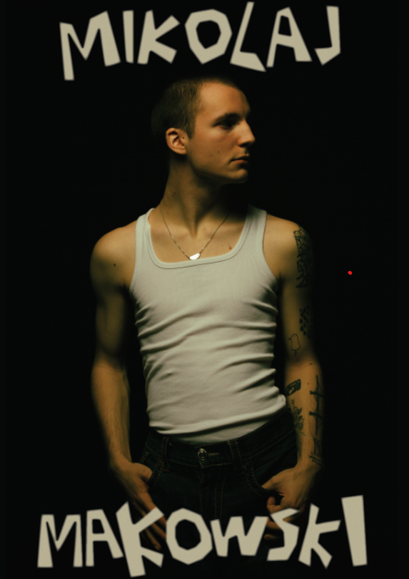
For my second poster I wanted to promote my passion for modelling, I did this by choosing the photograph for the poster to be one of the photographs I had taken which features a dark background with soft yellow lighting. The photograph has a warm yet dark atmosphere. I added my full name at the top and bottom of the photograph as this is a self promotional poster so I wanted my name on it, however this time i feathered the edges of the text. I did this due to the lighting on myself in the photograph being soft with no sharp edges visible as there is a smooth transition from darkness to myself, I felt like the plain text was too sharp which encouraged my decision to feather the text. This promotional poster shows the viewer that I have done modelling in my life without having to put it in text which makes it an effective poster.