Task 1 – Historical
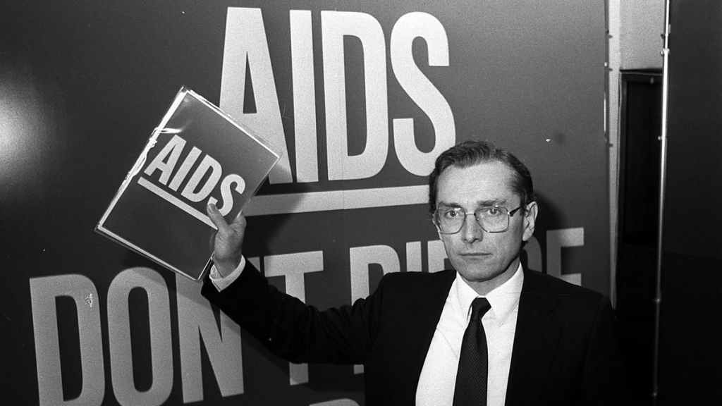
In 1986 the British government launched the world’s first ever public health campaign on AIDS. It was highly controversial and faced opposition from the Prime Minister at the time, Margaret Thatcher. The purpose of this campaign was to educate the public about AIDS as there was an incredibly large amount of stigma at the time surrounding people suffering from AIDS. This was due to the increasing rise of cases in the UK. This meant that newspaper adverts were published, a leaflet was sent to every home in the UK, and a television advert was also aired. Norman Fowler claimed that “90% of the public recognised the advert and a vast number changed their behaviour because of it” and as it was a “life and death situation…There was no time to think about whether it might offend one or two people”.
TV Advert
This video advertisement is a part of the AIDS information campaign. It showcases a volcano and an iceberg which are visual metaphors to show a direct association with death, with the intention too scare the public and take the issue seriously. Another example is a man chiselling the word “AIDS” into stone. This is a metaphor for the inevitable outcome of coming into contact with AIDS and also represents the rising amount of deaths inside of the UK from AIDS. Malcolm Gaskin, the designer at TBWA stated that scaring people was deliberate and needed to ensure that the public took the threat seriously and tried their best to remain safe and vigilant against AIDS.
Influences/campaigns TV adverts
Information Leaflet
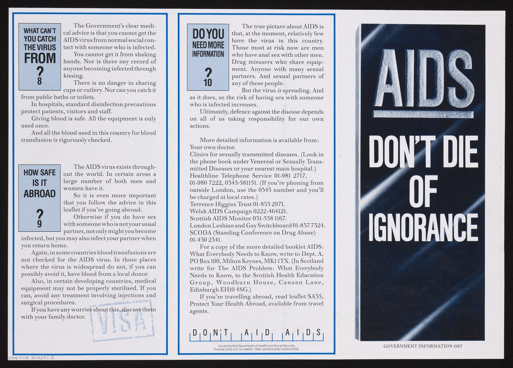
Here we see the information leaflet that was sent to every home inside of the UK to help inform everyone about how to keep safe from AIDS. The front cover of the leaflet contains black and white as it’s colours, emphasizing a depressing and apocalyptic atmosphere similarly to the TV advertisement that was created.
Impact
The impact of this campaign was highly successful in bringing the issue into the public awareness, with a staggering 90% in public recognition. It helped change sexual behaviour within the public and reduce the spread of the virus, making the infection rate lower inside of the United Kingdom than in many other countries by 1990. However, the campaign was heavily criticized by some people for being “victim-blaming“, which led to a continued stigma surrounding people with AIDS. Overall, this campaign shows how being brutal and upfront about topics can have a large scale impact on society, both good and bad as we can see from the 90% recognition rate and decreased cases, but also from the continued stigma.
References
Wikipedia contributors (2021) AIDS: Don’t Die of Ignorance. Wikipedia. Available at: https://en.wikipedia.org/wiki/AIDS:_Don%27t_Die_of_Ignorance (Accessed: 15 February 2026).
YouTube (1987) [Public Awareness Broadcast] – AIDs Monolith [YouTube]. Available at: https://www.youtube.com/watch?v=nZuP528HtKs (Accessed: 15 February 2026).
Department of Health and Social Security (1986) AIDS: don’t die of ignorance: government information 1987 [online]. Wellcome Collection. Available at: https://wellcomecollection.org/works/kx943x59 (Accessed: 15 February 2026)
Jeffries, S. (2017) How we made Don’t Die of Ignorance – the AIDS campaign. The Guardian. Available at: https://www.theguardian.com/culture/2017/sep/04/how-we-made-dont-die-of-ignorance-aids-campaign#:~:text=Nobody%20even%20knew%20what%20to,and%20she%20was%20probably%20right (Accessed: 15 February 2026).
Creative Review (n.d.) Can graphic design save your life?. Available at: https://www.creativereview.co.uk/graphic-design-save-life-wellcome-exhibition/#:~:text=design%20and%20health.-,Can%20Graphic%20Design%20Save%20Your%20Life?,alongside%20powerful%20anti%2Dsmoking%20communications (Accessed: 15 February 2026).
Wikipedia contributors (n.d.) AIDS: Don’t Die of Ignorance. Wikipedia. Available at: https://en.wikipedia.org/wiki/AIDS:_Don%27t_Die_of_Ignorance#:~:text=AIDS:%20Don’t%20Die%20of%20Ignorance%20was%20a%20public%20health,television%20advertising%20campaign%20was%20aired (Accessed: 15 February 2026).
Task 2 – Contemporary
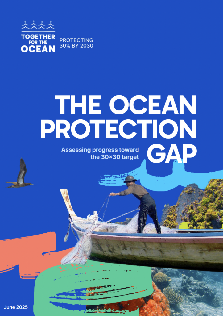
Together For The Ocean focuses on accelerating global action to protect 30% of the ocean by 2030 (30×30), highlighted by the April 2024 UN Ocean Decade Conference in Barcelona, to safeguard and protect the ocean for future generations by urgently scaling up marine protected areas, creating a sustainable blue economy and reducing marine pollution. One way this is done is by creating an urgent increase to the scale and pace of establishing new marine protected areas and other effective conservation measures, prioritising areas of high ecological integrity, to achieve 30×30 in the ocean, in collaboration with initiatives led by local communities.
COP30
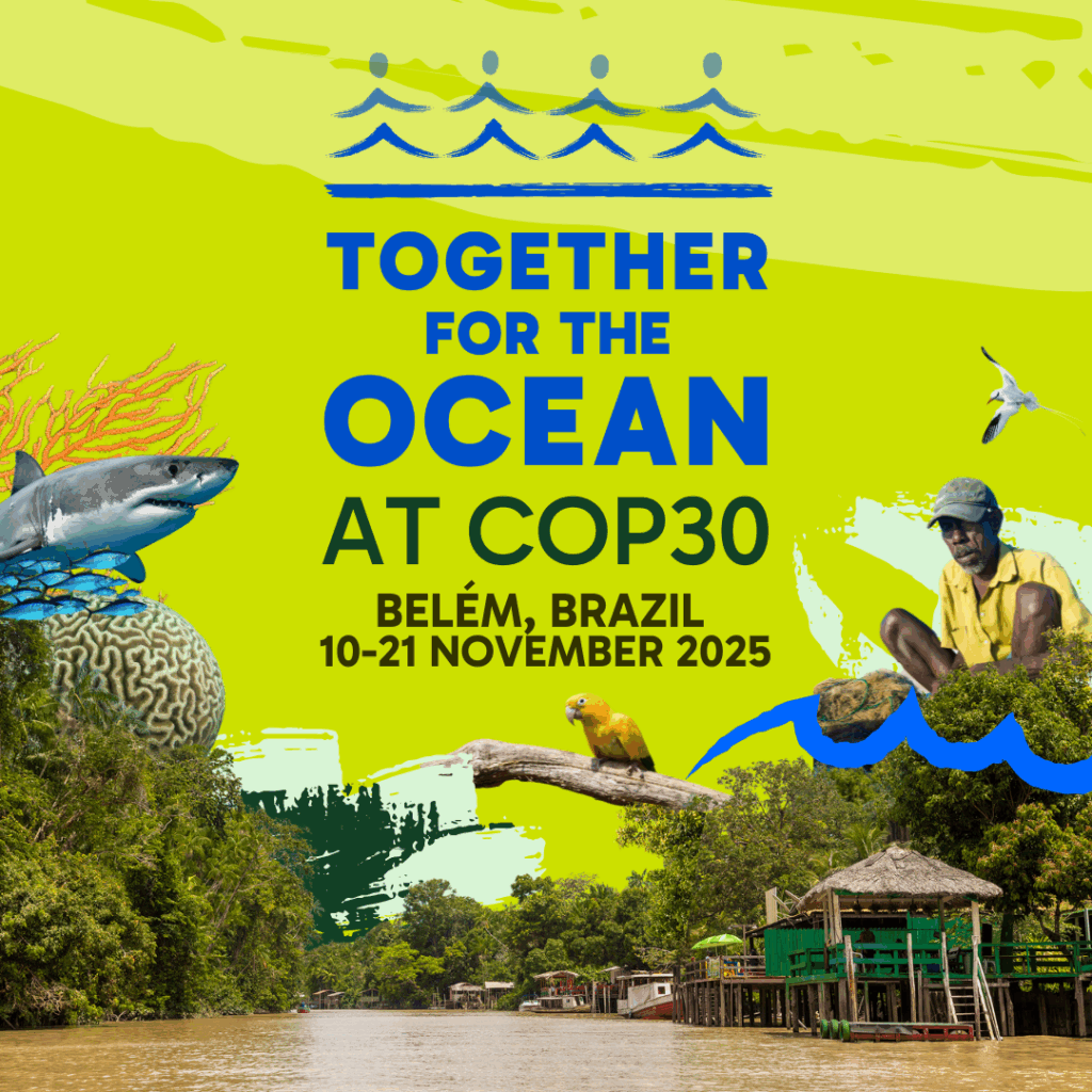
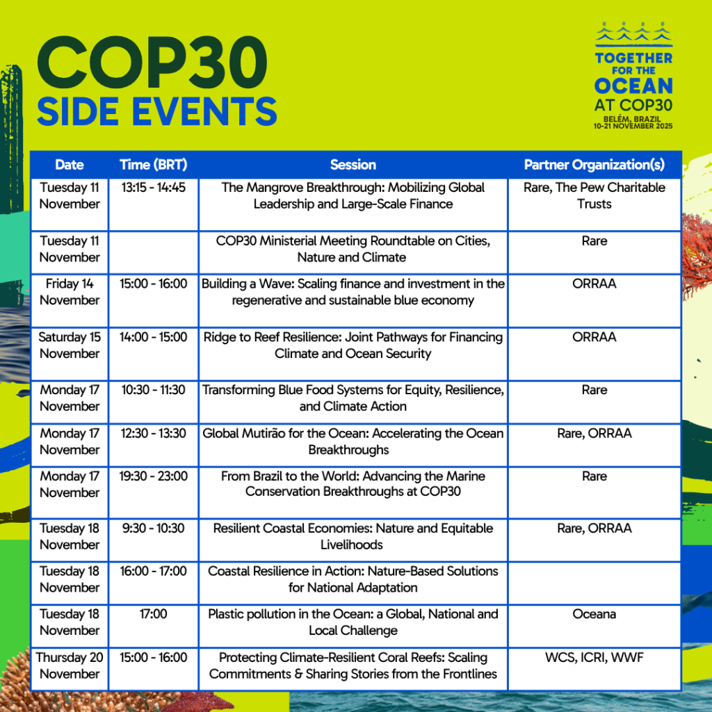
TFTO gathered at COP30 to act on and embed ocean-based solutions within climate strategies, from emissions reduction to adaptation finance with leaders at Brazil. Holding various events with various partners TFTO educated and persuaded partners on how to join in and better the ocean.
The results of the COP30 conference had mixed results, as deep divisions and a lack of binding commitments on key issues such as phasing out fossil fuels. However despite this large scale positive changes have been created from this such as many countries have agreed to a target of tripling finance for developing nations by 2035, aiming for roughly $120 billion per year. With such a large increase in funding this means that more countries can take extra measures such as disposing waste more safely and ecologically instead of dumping waste into the oceans. A plan has been created for these countries where they will be granted the financial support to transition into low carbon economies which leads to a reduction in global warming and climate related disasters inside the countries. This shows that despite the negotiations not being majorly successful, any small change can still have a large impact and pave the war forward with persistence onto inspiring others to take similar action.
Visuals
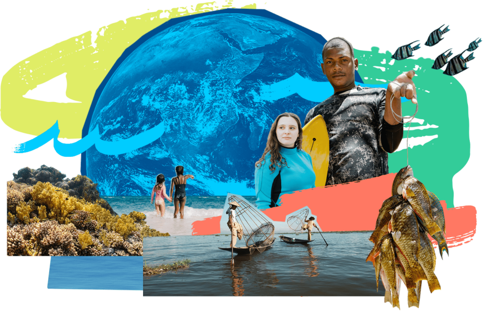
TFTO uses a collage style for their imagery in their campaign, this gives it a unique and eco-friendly look as their visual style appears as if it was created out of imagery that has been cut out of magazines and collaged together, this reinforces and promotes their brand values and identity as reusing materials would reduce waste and therefore keep the oceans clean.
References
UNESCO (2024) 2024 Ocean Decade Conference. Available at: https://www.unesco.org/en/articles/2024-ocean-decade-conference#:~:text=It%20will%20be%20the%20highlight,Ocean%20Decade%20roadmap%20to%202030! (Accessed: 15 February 2026).
Campaign for Nature (n.d.) Together for the Ocean [Event]. Available at: https://hacfornatureandpeople.org/event/together-for-the-ocean/ (Accessed: 15 February 2026).
For the Ocean (n.d.) Resources. Available at: https://for-the-ocean.org/resources/#:~:text=Commissioned%20by%20Campaign%20for%20Nature,Access%20the%20toolkit (Accessed: 15 February 2026).
Campaign for Nature (n.d.) Together for the Ocean [Event]. Available at: https://hacfornatureandpeople.org/event/together-for-the-ocean/ (Accessed: 15 February 2026).
For the Ocean (n.d.) COP30 [Event]. Available at: https://for-the-ocean.org/event/cop30/ (Accessed: 15 February 2026).
Task 3 – Collaboration Screen Time Vs Green Time
For the Screen Time vs Green Time project I’m working alongside Callum. The aim of this task is to highlight the benefits of the outdoors and encourage positive change in an age influenced by technology. Discussing this with Callum we decided to use phone photography as the focal point of our designs, this is to use and turn the influence of technology from a negative to a positive outcome. Everybody from a young age has a phone in this day and age, which makes phone photography the most accessible form of photography especially with no extra costs.
The audience we have decided is 14-29, this is due to screen time majorly affecting the younger generation, teenagers are spending more and more time inside and online instead of getting outside which leads to negative mental health and other negative impacts such as obesity.
My research showcases various existing posters that contain imagery of nature with white text, this was to focus on the nature and “green time” aspect of this task, I wanted this to combine this with the use of a phone in the centre. This was to use the inside of the screen for the area where I will add text, with the background being nature. I used my own nature photography for the background and then Callum took used his camera to photograph my hand holding a phone which I then cut out inside of photoshop.
I next caught up with Callum again, over the span of a few calls where we talked about our project and shared out screens digitally, we decided to change our design direction slightly. During the call we tried to really focus on how we can promote and encourage change within our posters. After further research we decided on the concept of using a train window to emulate a phone screen, with the message being “change your setting”. We ended up with our own iterations, mine using big bold text, masked outside the window looking as if the train is driving past the text, with the iphone “mute” display island at the top to inform the viewer to mute their phone and change their setting for a better one. I decided to use “settings” as a play on word for the settings found in all phones. Here are the three outcomes of this.
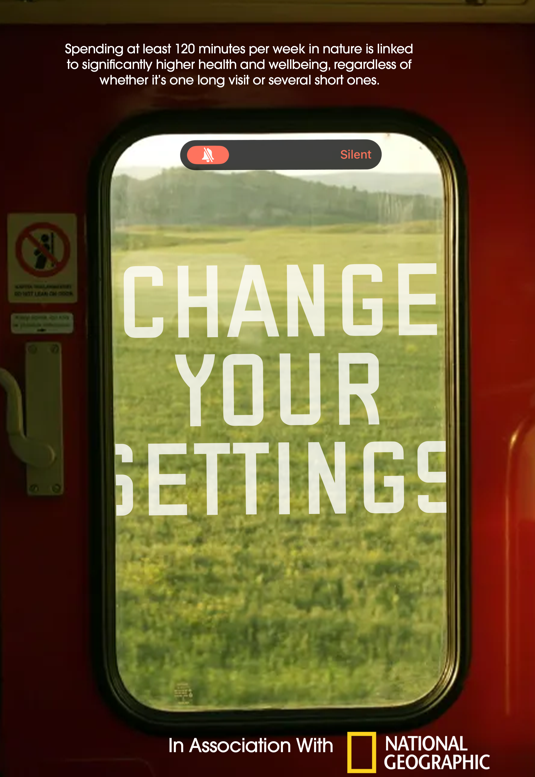
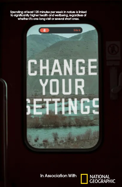
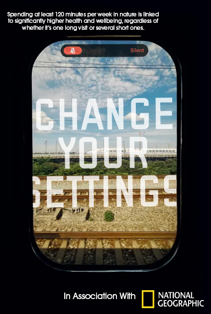
Overall I think the outcomes work great, they are in association with National Geographic as to make this a worldwide promotional campaign, attempting to reduce screentime everywhere. This group project has worked great as working alongside Callum allowed us both to bounce ideas off each other and help each other improve not just our skills but also our creative thinking, as we were both committed to working on this and setting up times to call to work together.