Brief
Research & Context
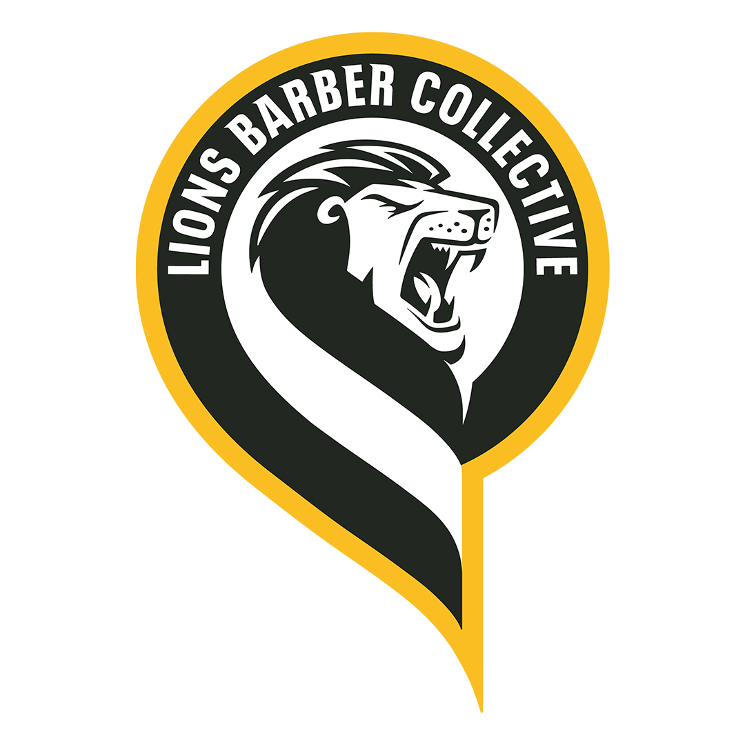
To start off my research I started looking at other campaigns that focused specifically on men’s mental health. One of these examples is The Lions Barber Collective, which was “Founded by Tom Chapman Hon LLD in 2015 after the loss of a friend to suicide”. It is led by “HereToTalk”, this campaign is focused to “create pop-up safe spaces where trained hair professionals could provide haircuts and engage in meaningful conversations about mental health.”. This campaign shows how a common activity such as getting a haircut can be transformed into something that has a positive impact on the local community and can bring people together simply through talking and asking the right questions. As a result of this campaign “Over 50% of men surveyed reported being more comfortable discussing mental health with their barber than with a doctor.”. This shows that campaigns that are based around talking can be effective, supporting that my campaign has the ground to have a positive impact.
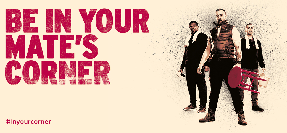
Another similar campaign is, “Be In Your Mate’s Corner” which is a campaign focused on men supporting their friends. Using a short one minute film and posters to spread awareness. The short film features three men ,equipped with items often used by boxing coaches, walking down the street and eventually finding a man that can be seen staring, lost in his own thoughts, the men then quickly set up a boxing ring corner and offer him support, a unique and engaging way to captivate the audiences attention and represent support in a way commonly seen by men watching boxing. This campaign shows that advertising that uses unique marketing methods may be more successful in gaining attention and creating success as they create more memorable advertisements that will caught more attention.
Conceptual Development
Starting my conceptual development I went straight to paper to start idea generation. I started focusing on “lateral thinking” to help guide and clarify my campaign, Figma states “Lateral thinking is a creative approach to problem-solving to unlock breakthrough solutions.“. I used this by following basic steps to secure a solid foundation for my campaign, I started with defining the problem, the problem in this case is the lack of men talking about their mental health. I followed this up by stating down possibly causes for this problem which include: Stigma / “Be a man” Mindsets, Societal Standards and the Manosphere which is “websites and blogs where men express opinions about issues concerning contemporary masculinity and male relationships with women, especially those associated with views that are hostile to feminism and women’s rights.“. I next proceeded to follow up with solutions for the problems and causes which include the following: Encouraging discussion, Influencing younger male audiences and opening event spaces to encourage and allow men to speak about their mental health.
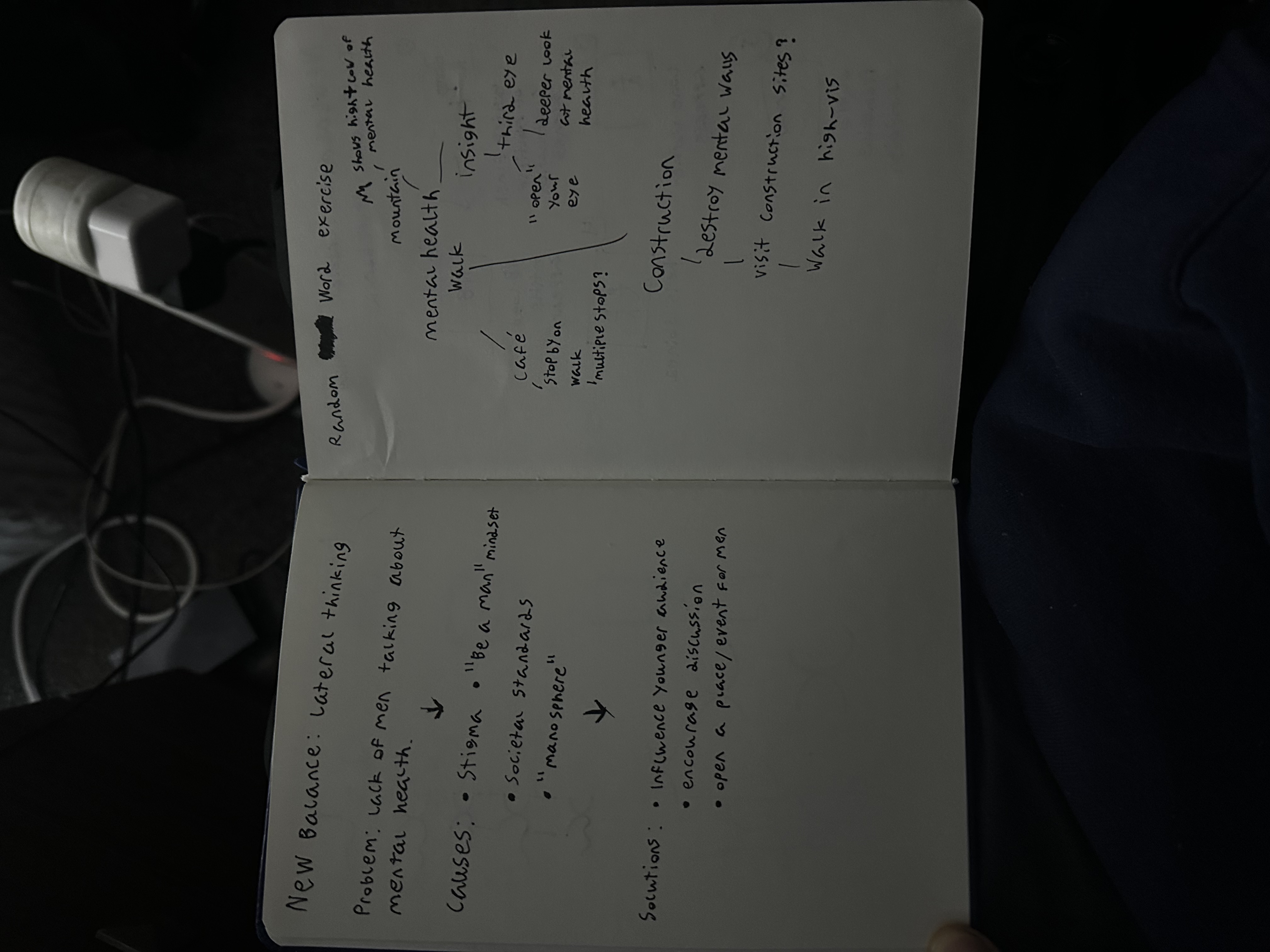
Having a solid foundation after outlining the problem, cause and solution I next moved onto idea generation for my campaign. I already established that this campaign will focus on a mental health walk for men, however I used a “random word” exercise to generate some out of the box ideas. This is where I write down random words and find ways to link them to my main subject. One word that stuck out to me was “Construction” as there was a construction show on the TV in the background as I did work, this gave me the idea to create a Walk N Talk promotional video focused on construction men as they are stereotypically meant to be seen as “strong”. To further my lateral thinking I backed this up with a storyboard.
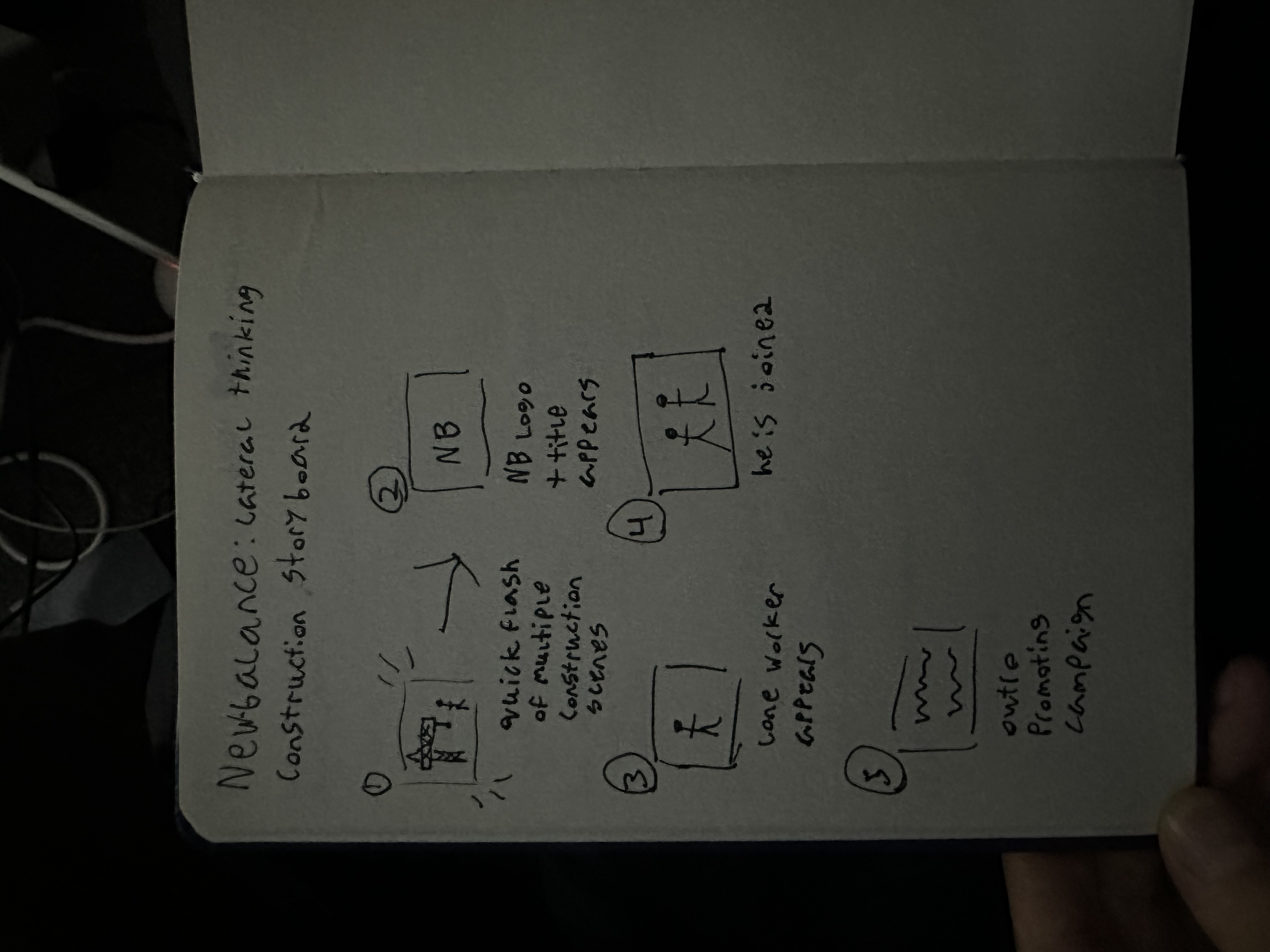
I researched various New Balance campaign videos on YouTube and looked at their brand guidelines as staying on brand and following the guidelines was something I planned to strictly follow in this assignment as good practice for the future. The videos I researched mainly had no speech, with an exception here and there for dialogue in the video. The videos are primarily visual with title text appearing to showcase the focus of the video, which I plan to follow by promoting “Walk N Talk”.
When it came to visual exploration I was limited to an extent as I planned to stick within the brand guidelines and create a project that felt like it was a truly a part of New Balance, this was reinforced by their campaign videos as they did not stray from the brands visual identity. Despite this self-set limitation it guided me on how I wanted the videos to feel and how to convey my campaign across. The visuals were going to be clean and minimal, I picked up on that New Balance uses bright colour grading in their photography and videos but still manipulates the levels to keep shadows dark to create contrast and a unique visual that reinforces their brand. I planned to use this across my campaign to keep that New Balance look.
Experimentation & Prototyping
I started off with the main form of advertisement in the Walk N Talk campaign, which is the billboard advertisements. I started looking for suitable photography to use across multiple websites such as Envato and Pexels. I focused on imagery that had groups or two people together, this was to reinforce the image of support and people interacting together, discouraging people from thinking they may turn up to the Walk N Talk and still be isolated. Focusing on people that look happy. I did choose some imagery that ended not being suitable due to backs being turned etc, which ended up not being used. Again following the brand guidelines I was using two typefaces primarily, “EB Garamond” and “ITC Avant Garde Gothic Pro“. I created a mood board of various campaign billboards and posters for inspiration.
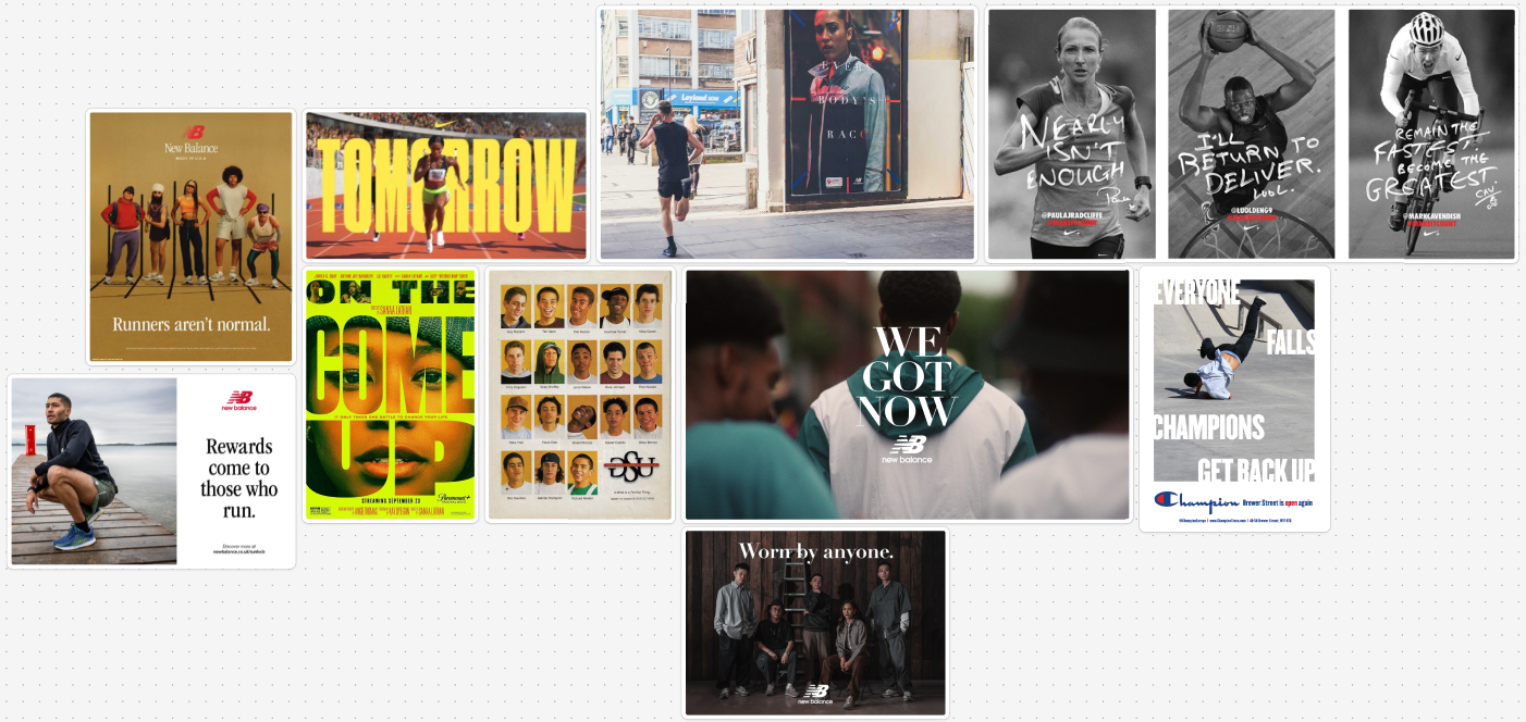
This board shows various style of campaign posters and billboards, I took note that New Balance uses “EB Garamond” for their title text which led to my decision to use that same type for “Walk N Talk” when it is being used as a title, which it will be in my set of three billboards for a visual brand consistency. This led me to my first billboard.
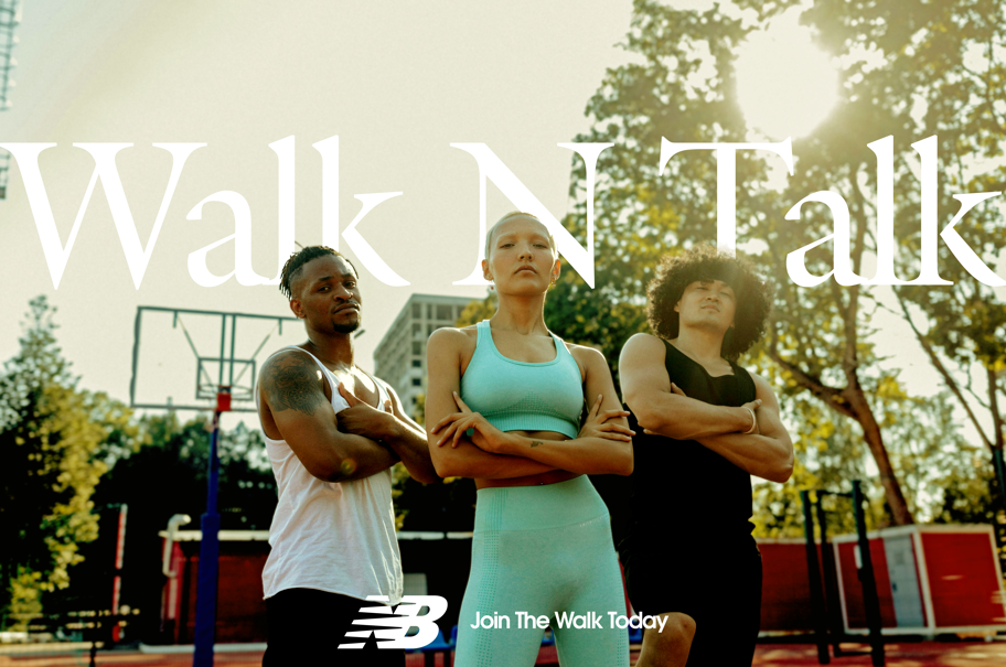
I started off with cutting out the three subjects at the front, which allowed me to use a mask and allow the title text to be featured slightly behind their heads, this was intentionally done to give the billboard more depth. I planned to have the text be slightly covered in each billboard to grant them all depth and visual consistency, allowing all billboards to be identified as part of the same campaign. I Then used ITC Avant Garde Gothic Pro for the subtext at the bottom alongside the New Balance logomark, this is the style I decided to have over all my billboards.
This was a Instagram reel style I tried for one of the promotional videos, this style didn’t work as I felt like the portrait footage I gathered was not relevant enough for “Walk N Talk” and seemed more focused on the brand, which led me to quickly shutting this version down and trying again.
This led to the first version of the horizontal video, after feedback I decided to go for a horizontal 20 second video as this is what is often seen in New Balance’s other campaigns. This gave me more freedom to include more footage and allow the viewers to take in the message, using upbeat catchy music to draw the viewers attention as this ad could not only be played on YouTube but in other medias such as cinemas. I created various versions with slight tweaks to before coming to the final version.
User Testing & Feedback
I used my classmates and family for user feedback as I wanted a mix of opinions from fellow designers but also non-designer feedback as that is the audience that will see the campaign the most. The feedback from classmates was overly positive, the direction and message was clear in my video and billboards, and minor positioning tweaks were suggested. The same can be said from the non-designer feedback, the billboards were appealing and the video was engaging. I applied the suggestions made and headed in the same direction due to the positive feedback.
However a key part of the feedback was on my second art direction. During this process I worried about my final outcome being too plain and simple. This led me to experiment with a completely different art direction, using a futuristic cyberpunk type style, trying to instead promote a run that sponsored mental health charities. I quickly made this mood-board for a visual feel.
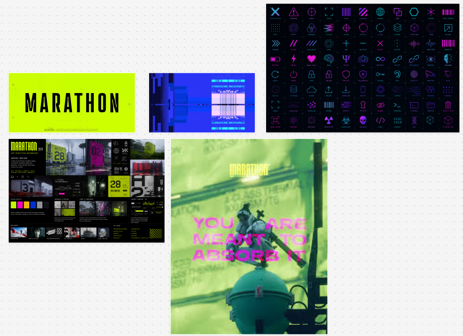
Which then helped me produce these results.
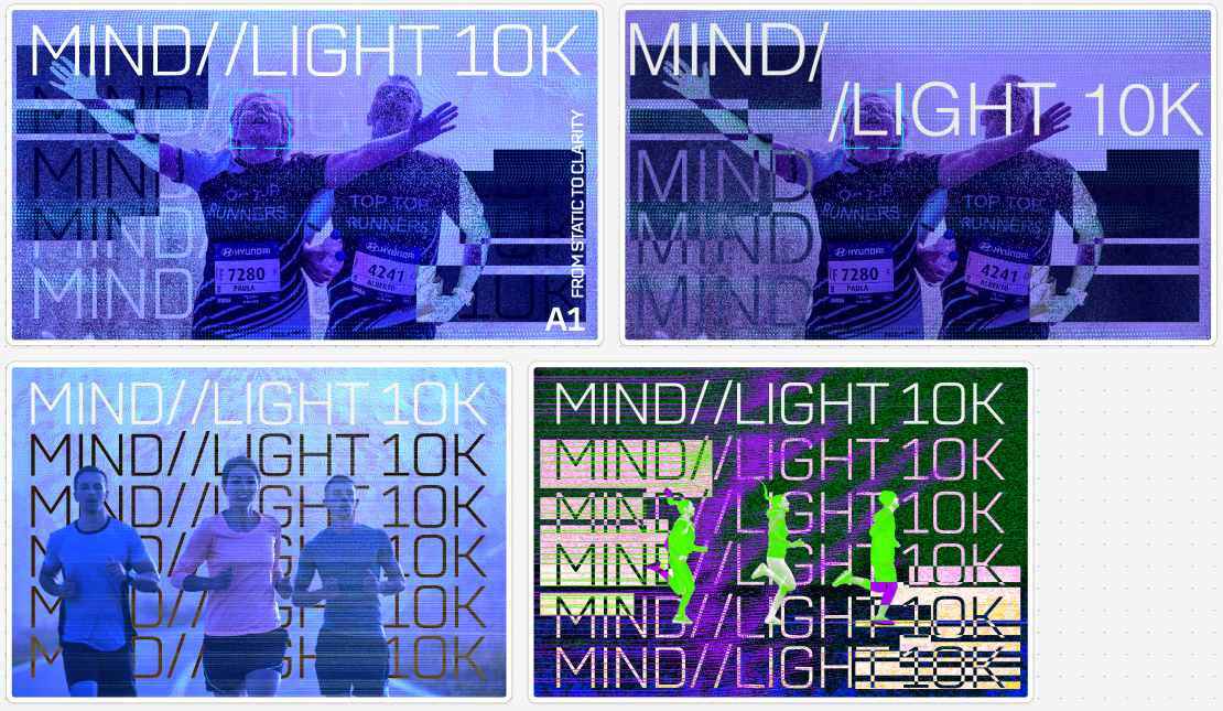
The feedback from this direction wasn’t positive at all, due to the theme not fitting mental health and “making it feel tech related”, the feedback on the final poster (top left) was that it didn’t give a clear message on the mental health aspect of the campaign. This led me to go back on track with my original art direction.
Informed Design Decisions & Direction
Again, for refinements I followed the user feedback that I’ve gathered and adjusted positioning of text and logos in the billboards, and also added animation effects to the video to keep the viewers more engaged with the message, the animations also help convey the message of the campaign more clearer by bringing attention to important text. The target audience changed throughout my project from “men’s mental health” to “everyone’s mental health”, this rationale is because I believe a brand would want to portray themselves as inclusive as possible, and that everyone’s mental health matters equally. Feedback for this change has also been positive from all parties asked. To prepare for final realisation I asked for feedback on all assets produced and ensured there were no mistakes throughout all assets I’ve created.
Final Video
Final Website
https://acrobat.adobe.com/id/urn:aaid:sc:EU:ea7259c1-e574-415b-9a98-44adf637722a
Presentation
References
Here To Talk Training (n.d.) Lions Barber Collective. Available at: https://heretotalktraining.com/lions-barber-collective/ (Accessed: 15 March 2026).
Telegraph Media Group (n.d.) Tom Chapman: The Lions Barber Collective. Available at: https://www.telegraph.co.uk/lifestyle/cancer-charity-gifts-in-wills/tom-chapman-lions-barber-collective/ (Accessed: 15 March 2026).
Time to Change (2017) Be in your mate’s corner and change a life – men urged in new mental health campaign. Available at: https://www.time-to-change.org.uk/news/be-in-your-mates-corner (Accessed: 20 March 2026).
Figma (n.d.) Lateral thinking explained. Available at: https://www.figma.com/resource-library/lateral-thinking-explained/ (Accessed: 15 April 2026).
Envato (n.d.) Envato. Available at: https://app.envato.com/ (Accessed: 4 May 2026).
Pexels (n.d.) Free stock photos and videos. Available at: https://www.pexels.com/ (Accessed: 5 May 2026).