FINAL DPS 1 CLEAR VERSION
FINAL DPS 1 GUIDES VERSION
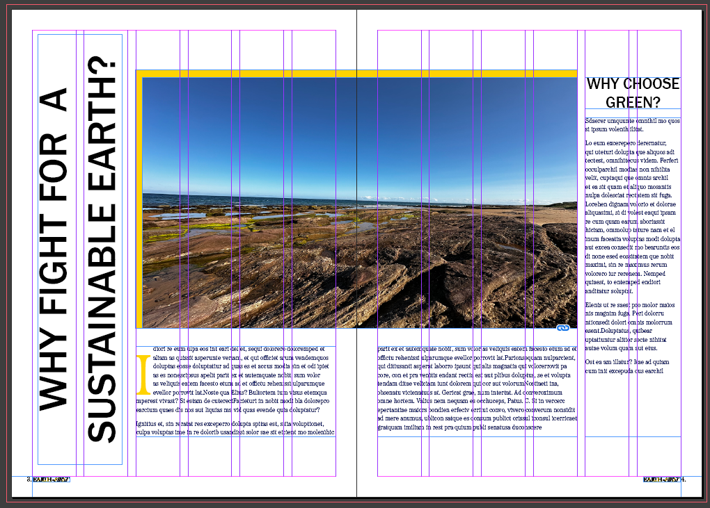
For my first double page spread, I used a six column grid, as I wanted to carry on my minimalist feel throughout all of my double page spreads to keep my designs corporate and matching which makes them recognizable to the “Earth-First” brand. I kept this design symmetrical to make the double page more aesthetically pleasing to look at by the viewer. I placed a photograph in the centre stretching four columns onto each page, the remaining two I left for text. The left side has a vertical title in large sans serif type to catch the attention of the viewer and help their eyes scan from left to right. I also introduced a large drop cap in the Honey Yellow colour which’ll direct the viewers gaze onto the body text. I made sure to add a drop cap and a yellow edge near the photograph to keep them corporate with my front cover designs.
FINAL DPS 2 CLEAR VERISON
FINAL DPS 2 GUIDES VERSION
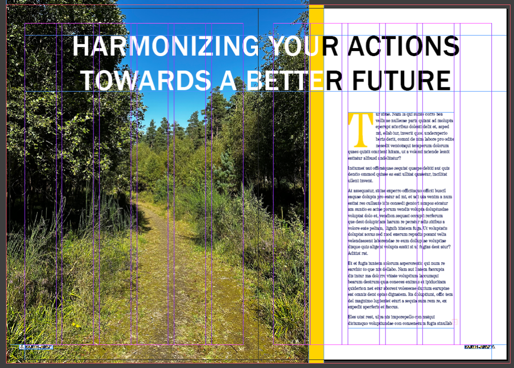
Here I tried a photograph focused design. In this design I used a quarter of the second page to cover it with the photograph. This was to provide an example of a DPS that contains a large image with lesser text and show the solution to that design. I again included nature photography into my imagery to keep the theme related to the theme of the magazine. Again I’ve included the Honeycomb Yellow block colour offset from the photograph to keep the magazines corporate. On the right hand side I added. I used three columns for the main body text of this spread, I again added a Honeycomb Yellow drop cap at the beginning of the main paragraph.
FINAL DPS 3 CLEAR VERSION
FINAL DPS 3 GUIDES VERSION
In my final double page spread I used a three column grid again for the main body text. I also added two pull quotes in this which use the “Etna Regular Italic” typeface, this was to keep the pull quote standing out throughout the body text whilst maintaining a familiar feel due to it being from the same type family. I also went back and added a folio in each corner alongside a smaller version of the masthead to keep the brand name visible to the viewer at all times. On the columns unused by the text, i used the photography and Honey Yellow block colour to keep the magazine pages corporate and recognizable to the brand.