Good Typography Example
I like the sans serif heading
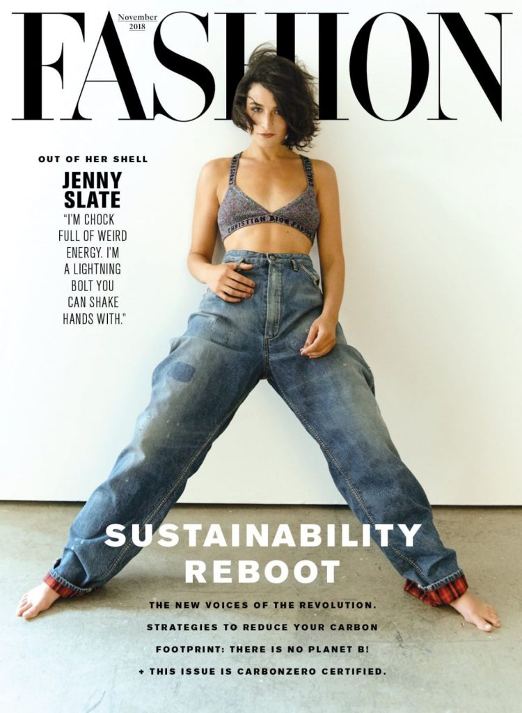
This is a good example of a good typographical design. First, this magazine has a good use of type hierarchy. Alma Hoffmann (2022) explains that “the manner in which we organize the text, the headers, the subheaders, the columns, the paragraphs, the callouts, and others on the page or space signify their importance.” We see this in the way that the main title of the magazine is clearly at the top of the layout, it uses a serif typeface which gives off a feeling that the brand is high quality and brand exclusivity, the serif typeface is commonly used in fashion magazines for this reason, one good example of this is Vogue who use a serif typeface in their masthead.
The type that the masthead uses is black which contrasts with the white background which causes the viewer to focus onto the masthead, this means that the masthead is the dominant element as after viewing the masthead the rest of the design is focused on. Steven Bradley (2015) says “The focal points in your design should stand out but should be noticed after the element with the most dominance.” The type is partially hidden behind the model’s head which creates a focal point onto the models face. On the left side of the model, we see a sub-title which shows off the model’s name in bold sans serif font, to contrast this below is a quote in light sans serif font. Towards the bottom third of the magazine, we see a bold sans serif title named “sustainability reboot”
This is crucial as it tells the viewer what the magazine is about. All these aspects synergize in this layout as the viewer first looks at the models face whilst reading the masthead, next the viewers eyes lead down and next see the “sustainability reboot” and then back up to the model’s name. Overall, this magazine cover portrays a minimalist use of typography with how much leading there is between texts,
Bad Typography Example
I dislike the crowded text on both sides of the cover
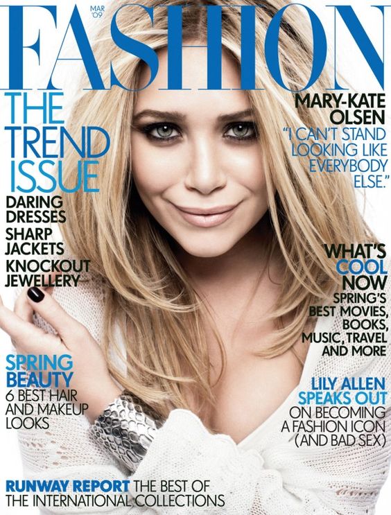
This is my chosen bad example for a magazine cover. The magazine doesn’t follow the text hierarchy as the masthead is the biggest, however all the following information is all the same size. The surrounding titles also use a large amount of bold text. This can make it confusing as to which information is more important than the rest for the reader. This makes too much reading for the viewer and may make the viewer overwhelmed which may discourage them from reading the magazine overall.
The magazine has a blue, black and white colour scheme, however the colour clashes with the model’s hair. For example in the top right, the pull quote is in blue and uses a thin serif typeface. This combination of placement and thin type makes the pull quote much more illegible than if it was a thicker type.
Fixed Typography
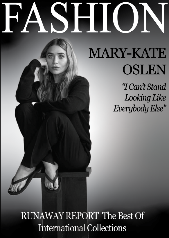
I created my own magazine cover as I couldn’t find the original photograph with no text so I created my own by selecting and masking Mary Kate Olsen. Firstly, I kept the masthead a serif font, however I changed it to a bold version as this makes the masthead contrast the black gradient behind it. I did the same for the text at the bottom as the top and bottom areas of the magazine cover are darkest to help create contrast which’ll help catch the viewers attention.
I kept the text on the right hand side and made it smaller than the masthead to create a flow of text hierarchy, making the viewer look at the masthead, then the text underneath on the right side. I chose a bold serif font for “Mary-Kate Olsen” to signify her importance, underneath I decided to use an italic version of the serif font for the pull-quote as this makes it stand out more. Next I made the text at the bottom slightly smaller than the pull quote to keep the trend of text hierarchy up.
References
Alma Hoffman (2022) https://www.smashingmagazine.com/2022/10/typographic-hierarchies/
Steven Bradley (2015) https://www.smashingmagazine.com/2015/02/design-principles-dominance-focal-points-hierarchy/