Good Conceptual Design Example
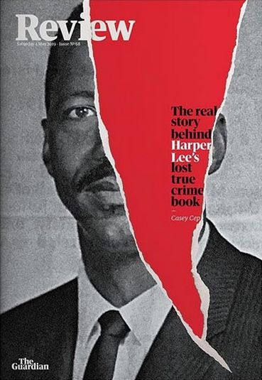
This magazine cover has a prominent photograph of a man that takes over the entirety of the cover. However, what makes this composition good is not just the portrait but also the creative use of a rip that disrupts the image. This tear is strategically placed to show the inside of the magazine.
This tear shows a red that is used as the backdrop behind the front cover. This bold red instantly draws our attention as it represents blood which is a common occurrence inside true crime. The impact of this color choice is clear that the placement of the rip across the man’s portrait further reinforces the idea that the red backdrop represents blood. According to Kuniecki, Pilarczyk and Wichary (2015) “The color red attracts attention in an emotional context.” which reinforces why the designer would use red to represent the blood colour and create a focal point in the centre of the magazine. The deliberate positioning of this tear across the image shows a connection between the man and the concept of blood.
Adding depth to this intricate visual, the text within the red area says “The real story behind Harper Lee’s lost true crime book.” This wording links the imagery directly to the world of true crime. The combination of the text with the red background solidifies the idea that this colour represents blood.
The designer could have taken the straightforward route of using red blood splatters or featuring the rip alone but instead combined the idea of blood being inside the rip. This combination of visual and text elements captures the viewer’s attention but also conveys a deeper message which is successful conceptual design.
Bad Conceptual Design Example
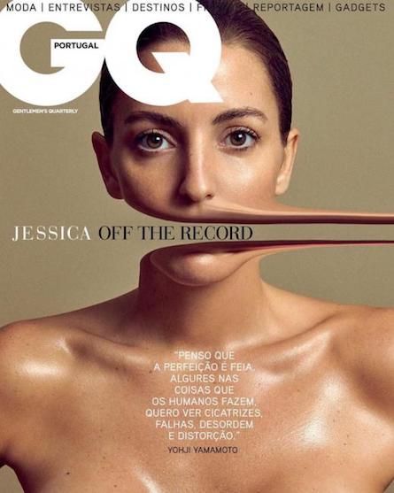
I think that the “record” could be more creatively displayed
GQ Portugal’s magazine cover has a plain, dull dark beige background. It showcases a close-up of a model making direct eye contact with the camera. Notably, the model’s mouth extends off the magazine’s right side, revealing the text “JESSICA OFF THE RECORD.”
This text suggests the magazine is like a “record,” but this concept could be clearer. Adding an image of a record or a notebook to the background would help reinforce the idea. This would make the connection between the model’s mouth and the magazine’s theme more direct, ensuring that the concept is easily understood.
Conceptual Redesign
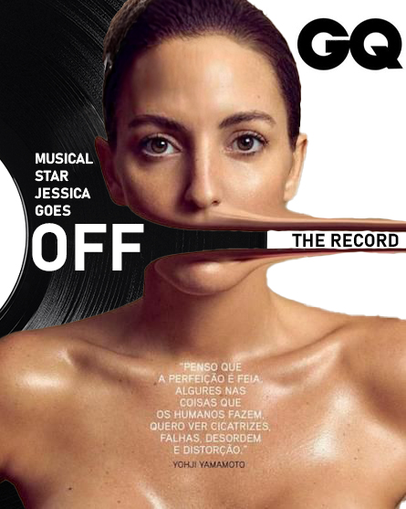
In this redesign, I went for a white background to create a striking contrast with the model’s skin tone, bringing attention to the bright white light on the model’s skin.
To play with the concept of “off the record,” I placed a vinyl record into the background. I made this choice because of the model’s distorted mouth moving into the empty space on the right, due to the gap between the lips, I placed the words “THE RECORD,” emphasizing the idea of going off the record both visually and conceptually.
To maintain a balanced and symmetrical composition, I added “MUSICAL STAR JESSICA GOES OFF” onto the record. This meant that the visual elements were more symmetrical and provided text on both sides, contributing to a more visually appealing overall design.
References
Kuniecki, Pilarczyk and Wichary (2015) “The color red attracts attention in an emotional context” https://www.ncbi.nlm.nih.gov/pmc/articles/PMC4413730/