Good Composition Example
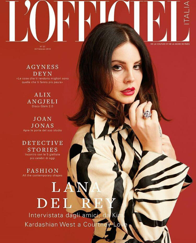
I like the colour and the positioning of the text and model.
This magazine employs a simple yet effective design. It features a plain red background with white text positioned at the top. Just above that, you can see the masthead. The model’s face partially obscures the bottom part of the masthead, which naturally directs the viewer to the model’s face and then guides your eyes to read the magazine’s title.
The model in the layout is dressed in black and white, which occupies a large portion of the magazine’s space. This grabs your attention to shift toward the model’s clothing and then naturally leads your eyes to the prominent “LANA DEL REY” text.
This text’s placement in the design hierarchy positions it as the second-largest element, showing its the second most crucial title for the reader.
The magazine’s composition seems simple, but this is done to easily grab the viewers attention. The red background and white text provide a contrast that immediately grabs your attention whilst keeping a balanced composition. Steven Bradley (2017) says “Balancing a composition involves arranging both positive elements and negative space in such a way that no one area of the design overpowers other areas.” which this magazine does perfectly.
Bad Composition Example
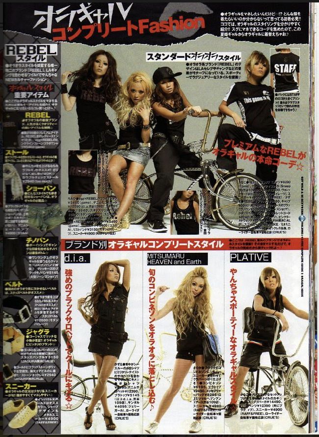
I dislike the crowded text in this cover.
The left column of the magazine is crammed with lots of tiny paragraphs and small text, which can be quite overwhelming to look at. The text is so packed together, and there’s not much empty space, which makes it hard to read and focus on the content. This might discourage readers from wanting to read the magazine.
In the upper part of the magazine, there’s a photo of some models. The text in this section is in black, but it’s tough to read because it clashes with the black clothing the models are wearing and the shadows in the photo.
At the bottom of the magazine, the content is split into three columns. Each column has a title at the top and a big paragraph at the bottom. However, the text clashes with the models and objects in the photos, making it difficult to understand what’s being said.
Composition Redesign
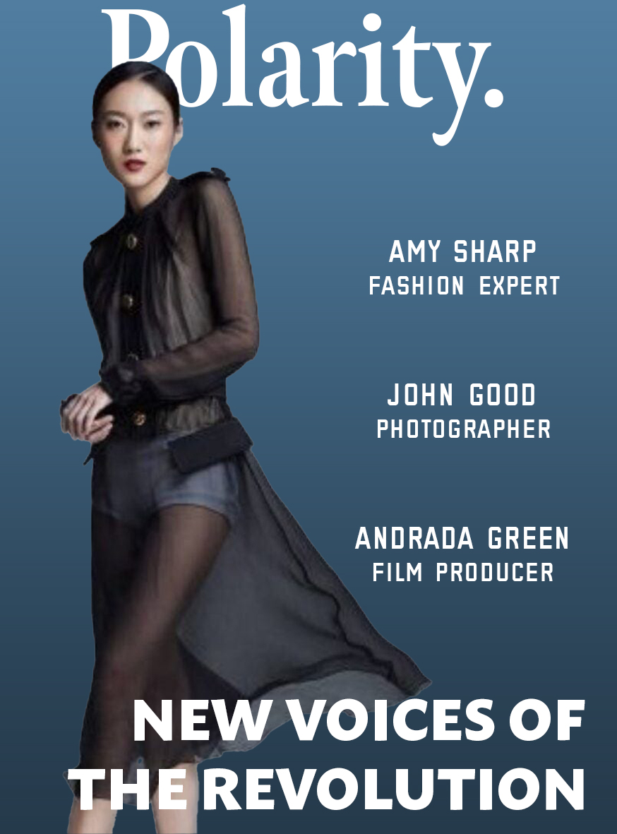
In my redesign I started again from scratch, as the cover was so overcrowded and photographs low quality I went for a more simplified approach. I decided to go for a white and blue colour scheme which evokes an emotion of calmness to the viewer as the background has a dark to light blue gradient which is reminiscent of the sea.
I added a white serif masthead as from research this is a common trend in magazine covers. To contrast the serif masthead I added sans-serif titles on the right hand side of the model, with another stretching along the bottom of the magazine.
I ensured the model’s head covered part of the masthead, this is to create a focal point and make the viewer look at the top area first, this would cause them to look at the model and then her clothing, this would cause the viewer to look from top to bottom on the left hand side of the magazine leading them onto the second most important title “NEW VOICES OF THE REVOLUTION”. This is the second biggest text as it is the second most important, following the text hierachy. The viewer would then read the names on the right hand side climbing up as I staggered the text like a ladder, this then leaves the viewer back at the top of the masthead completing the loop.
References
Steven Bradley (2017) “Balancing a composition involves arranging both positive elements and negative space in such a way that no one area of the design overpowers other areas.” https://www.smashingmagazine.com/2015/06/design-principles-compositional-balance-symmetry-asymmetry/