Good Colour Example

I like the colour scheme of this magazine.
This magazine employs a color scheme consisting of black, red, and white, and these colors work harmoniously to create a vibrant contrast. This contrast is particularly evident in the prominent white text scattered across the magazine cover. The strategic placement of this text serves as a visual guide for the viewer, leading their gaze from the masthead at the top, down to the left, and then to the bottom right corner of the magazine. This text is strategically positioned against the black background caused by the models clothing, maximizing the contrast and creating a visual impact through contrast.
The model featured in the magazine is wearing black clothing and is sat on a red chair. As Kendra Cherry (2023) points out, “red is a color known to evoke strong emotions.” In this context, the use of red creates an impression of power and dominance, further emphasized by the model’s confident expression, open body language, and direct eye contact with the camera. The red color compliments the white text and the model’s pale skin, highlighting the contrasting colors. The specific shade of red chosen for this magazine cover is darker, providing contrast to the bright white elements alongside it.
This thoughtfully curated color scheme not only enhances the visual appeal of the magazine but also plays a crucial role in creating emotions in the viewer. The black, red, and white colours create a balanced visual composition, creating a magazine cover that effectively engages its audience.

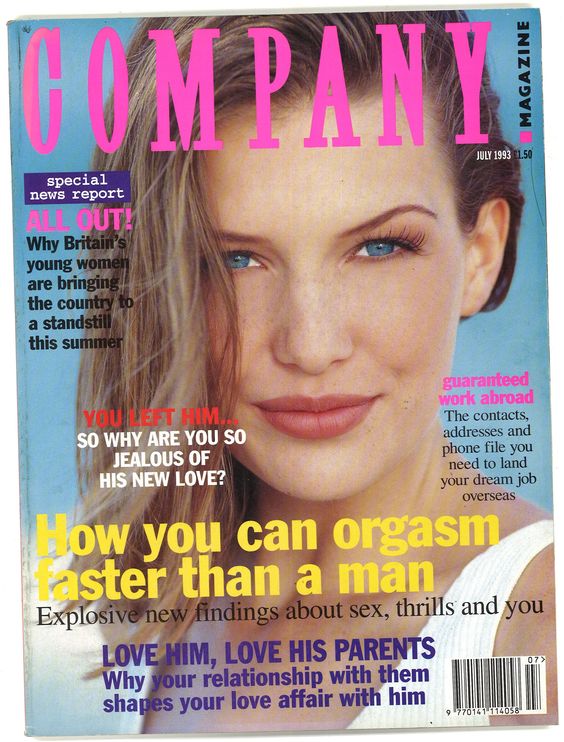
I dislike this cover as there is too many coloured titles.
This magazine showcases a woman staring directly into the camera with a light blue background, at the top of the model’s head we see the masthead in bright pink text, this is one of the many colours you can see on the front cover of this magazine, we also see black, white, blue, red, purple and yellow. This makes the magazine have a colourful and playful feel however it causes visual clutter which draws away from any focal point being created. The large amount of different colours is overwhelming and not appealing to the viewer, Elizabeth Keyes (1993) “if there are too many colors or if color is badly used, it will have the reverse effect and actually lower the cognitive limit”. This means that the viewer may struggle to understand which titles/ areas of the magazine are more important.
The different amount of colours causes loss of hierachy in the titles and text, as each title has it’s own seperate colour, except two which match the colour of the masthead, it further confuses the viewer on the importance of each title. This confusion is further reinforced by the fact that the typography in the design is mixed too. The magazine features three different fonts, two serif and one sans serif fonts, one of the serif fonts located at the top left corner is in white text with a purple background, however at the middle right there is a different serif font with black text. This again can mislead the viewer when trying to figure out which text is more important than others on the magazine.

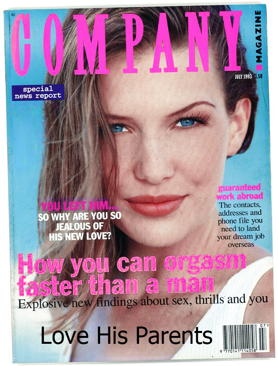
In my redesign I started off by changing the colour of the titles to bright pink, I made this change as I wanted the titles to match the colour of the masthead. This showed the viewer clearly that these tiles are important and reinforces the text hierachy. This light pink colour compliments the light blue background which is why I decided to keep it bright pink instead of changing it to another colour. I also decided to keep the sans serif title white, as this title is close to the models face it means it’s closer to the focal point of the magazine, putting it higher up in the text hierachy which made me want this text to stand out from the rest.
Next I replaced the dark purple text at the bottom and replaced it with a shorter and simpler black text title to match the text above it. This is again to reduce the amount of colours found on the magazine and keep the magazine cover a specific colour scheme. I also removed the text on the left hand side to make the magazine feel less cluttered with text and colour, this emphasizes the importance of the remaining text to the viewer.
References
Elizabeth Keyes (1993) page 646 “if there are too many colors or if color is badly used, it will have the reverse effect and actually lower the cognitive limit” https://www.jstor.org/stable/43090213?saml_data=eyJzYW1sVG9rZW4iOiJhMjRlY2YwOS1kZWNmLTQ1OTgtYWY4My0yN2VlZDgyY2IzMTYiLCJpbnN0aXR1dGlvbklkcyI6WyJkMTljZGExOC02NWJmLTQ1MTEtYTIwYy0yMWI5NTViMzBkMTgiXX0&seq=1