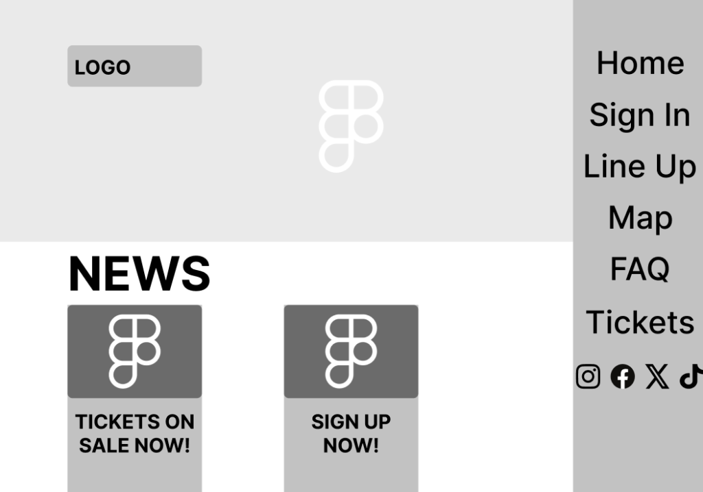
This is my mid-fidelity homepage, one of the main changes in this version is that I have decluttered the home page, this is because the low fidelity version had a large amount of text and buttons, this may have overwhelmed some viewers and made the website unappealing. To fix this I added a large banner at the top which will contain a gif of the festival, this’ll help entice and excite users and help persuade them to make a purchase. Underneath the banner I added the “news” section, this is now split into smaller boxes which only contain a title which will stop users from getting an overwhelming amount of information as soon as they enter the website.
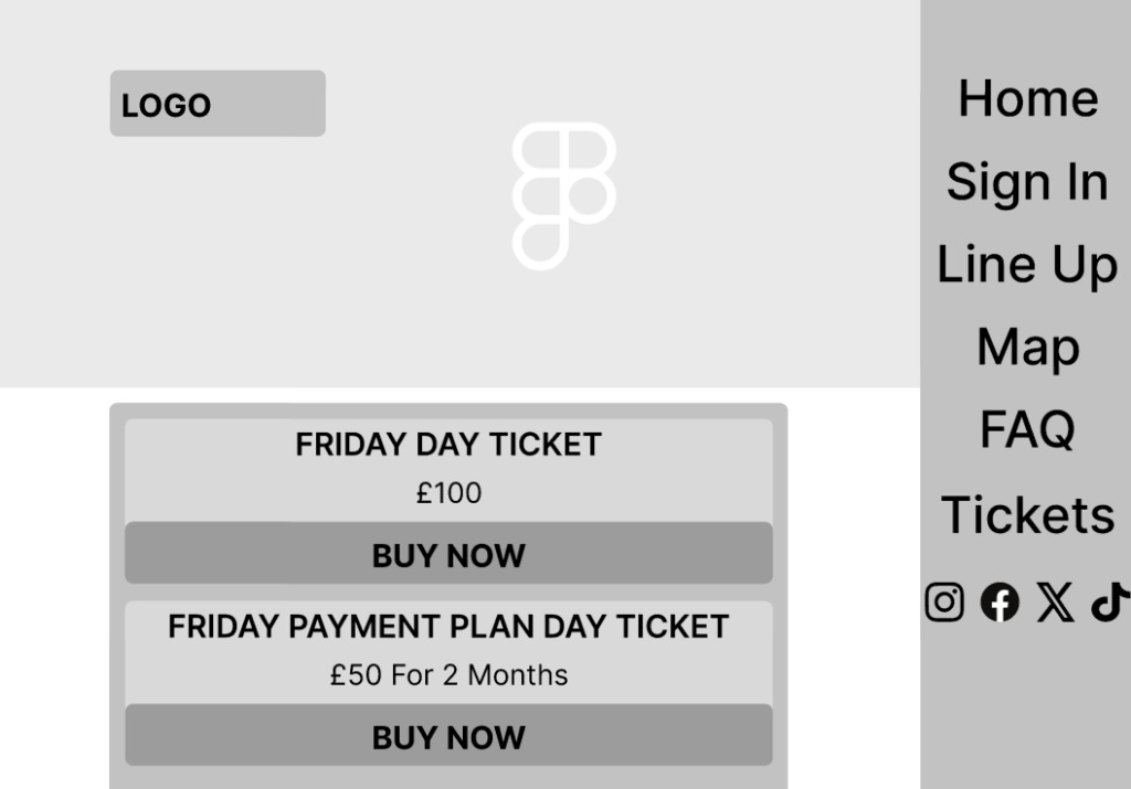
Here is my tickets page, this page faced a similar problem in the low fidelity stage. There was too much text which made the page look overwhelming and boring, users who may be visually impaired will have an easier time navigating this page with the bigger buttons and less cramped in text, I have also added the payment plans underneath it’s respective ticket to allow for easier navigation as to which plan the user is going to purchase.
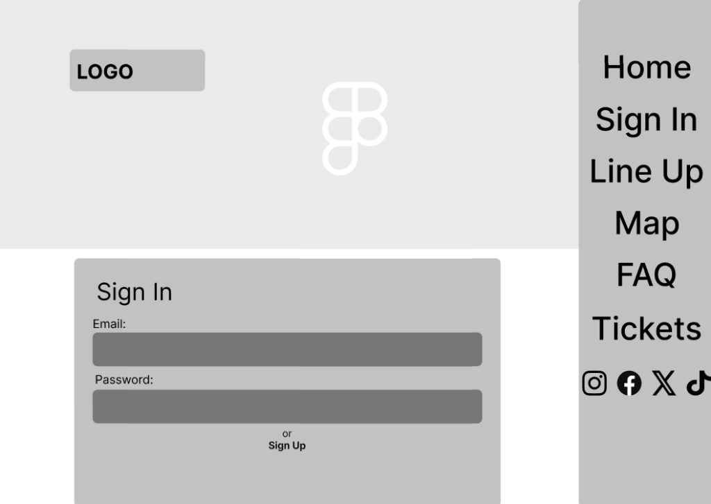
Once again the main criticism from feedback of the low fidelity is the lack of imagery used on the prototype, this is why the animated banner will be a unique aspect shown on all pages. In this sign up page the design this time is spread out which has reduced the leading between the banner on the right hand side and the edge of the website on the left. Another feature which was completely missing from the low fidelity version has been added, this being the “Sign Up” link at the bottom which allows users to create new accounts if they do not have one already.
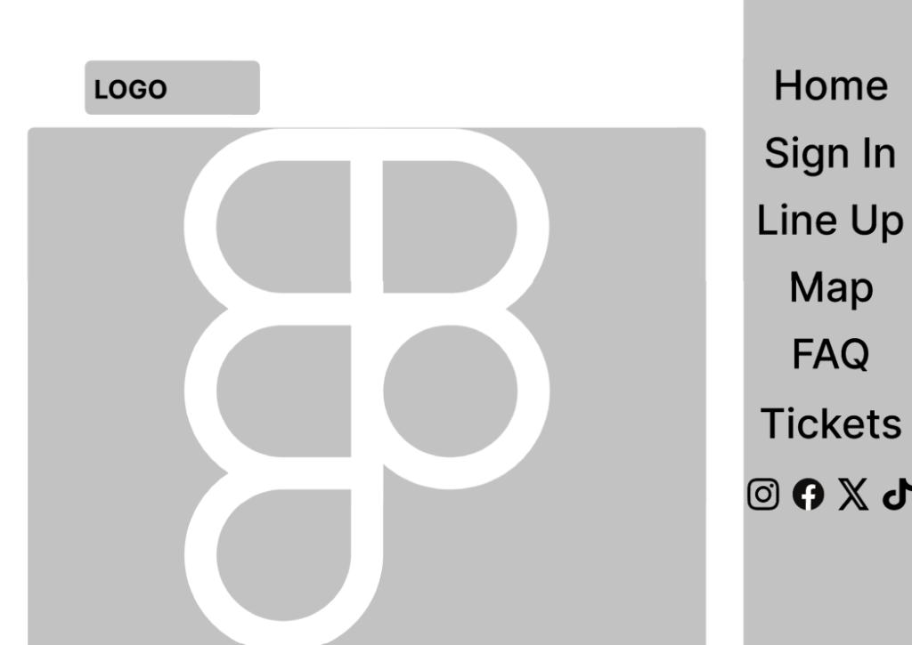
One of the major changes in the mid-fidelity prototype is that the “info” page has been completely scrapped, this is due to feedback saying it’s too similar to the FAQ page and could possibly be integrated inside the FAQ page. This led to the page being reworked into a map which is much more beneficial for the user to find out information about the festival and how accessible it may be for them.
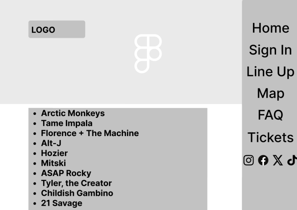
The Mid-Fidelity prototype, similarly to the Sign In page, has been stretched out again to reduce leading on both sides. Here you can also see the updated banner on the right hand side, which includes a list of key pages on the website with most important being on the top and bottom, as Glanzer & Cunitz (1966) state “participants recalled more words from the beginning of a list of words (the primacy effect) and the end of a list of words (the recency effect) than those from the middle of the list.” which led to the “home” button being on the top and the “tickets” button being on the bottom.
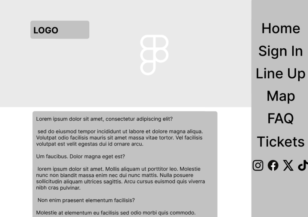
In this page, I once again extended the main section which includes the FAQ for the festival, and allows the users to find out information about the festival as the info page got integrated onto this page.
References:
Glanzer, M. and Cunitz, A.R. (1966) ‘Two storage mechanisms in free recall,’ Journal of Verbal Learning and Verbal Behavior, 5(4), pp. 351–360. https://doi.org/10.1016/s0022-5371(66)80044-0.