Initial planning phase, including project goals and initial sketches.
Raise awareness and reduce stigma by educating the public about addiction as a recoverable condition and encourage empathy. This can be done by creating promotional content for social media, the goal is to create a trending hashtag named “#RiseAndRecover” which links back to OSHI’s new logo which can be depicted as a sunrise through the use of it’s colouring.
Boost engagement by encouraging users and the public to participate in activities like challenges, donations, and volunteering. For example, a simple challenge could be taking a photo of a sunrise and sharing it on social media with the campaign hashtag, helping to raise awareness and create a sense of community. These efforts not only motivate action but also create a greater sense of involvement in the cause.
Promote hope and empowerment by crafting a positive narrative around addiction recovery, highlighting themes of personal growth and fresh starts. This can be done by sharing uplifting and supportive content across the campaign’s social media platforms. By focusing on inspiring stories, affirmations, and information, the campaign can foster a sense of hope and motivate those on their recovery journey and reduce stigma.
Redesign existing OSHI website to be aimed to create a platform that reflects OSHI’s mission of recovery and community support while enhancing functionality and accessibility. This can be done by adding the new lotus logo and a colour palette of gold, orange, and black, the site will show themes of hope and victory over addiction. The redesign prioritises user-friendly navigation to connect individuals with resources, promote the #RiseAndRecover campaign, and give a sense of community through personal stories and shared milestones. The site encourages meaningful actions such as seeking help, donating, or joining the campaign. This transformation positions OSHI as a beacon of hope and empowerment for those on their recovery journey.
Regular updates on design iterations, including wireframes and prototypes.
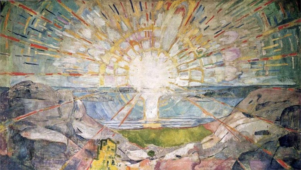
I started researching additional colours to replace the existing white and blue colour palette which feels too cold and clinical for an addiction recovery non-profit organisation. This led me to plan on a different colour scheme. I looked at various artists that have illustrated or painted the sun which led me onto Edvard Munch, the use of block colours to depict sunrays inspired my new colour scheme for OSHI as this related to the sunrise in the painting it gives the new colour scheme various meanings. Orange represents energy and hope bringing motivation and encouragement for those in recovery. Gold adds warmth and symbolises achievement, which ties into themes of personal growth and recovery.
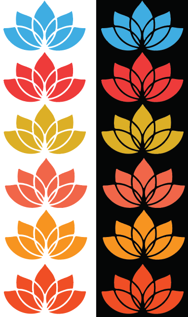
I began by experimenting with the color palette, as the original blue used in the OSHI lotus logo felt overly clinical and lacked warmth. Drawing inspiration from my research into Edvard Munch, I tested various shades of orange and yellow to replace the blue. The goal was to find colours that would not only align with the rebrand but also evoke feelings of hope, energy, and positivity.
The oranges were chosen for their links with health and renewal, while yellows symbolised optimism and warmth. I evaluated how each shade looked on the lotus design by applying various shades of yellows and oranges. The final decision was to choose an orange and a yellow instead of a singular colour for the whole lotus. These were chosen for their ability to create a welcoming and empowering feel. This exploration laid the foundation for the cohesive and meaningful colour scheme that now defines the new branding.
The next step involved applying the chosen colours to the redesigned OSHI logo, using various symbolic elements into a new design. Each segment having a unique meaning, with its shape and colours reflecting a distinct idea tied to OSHI’s mission. When broken down, the individual pieces remain meaningful, emphasising the brand’s values while maintaining a clear visual identity.
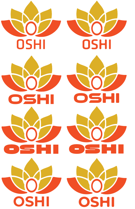
After finishing the primary visual logo, the next step was selecting a typeface that complemented the OSHI brand while complimenting the lotus element. I looked at a range of fonts, from minimalist sans-serifs to more stylised options. To not stray from the logos design which is recognisable by soft, curved lines without sharp edges. I changed the chosen typefaces to include rounded edges. This adjustment ensured the font felt part of the lotus, reinforcing OSHI’s new and approachable brand identity.
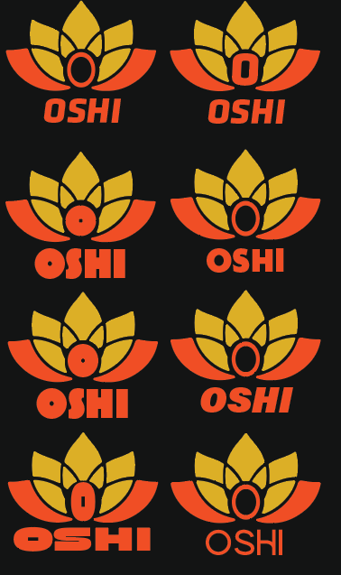
I revisited typeface exploration, as the initial selections didn’t feel suitable for the OSHI brand. I experimented with thicker typefaces to compliment the bold sections of the lotus design. However, I decided against these, due to the weight of the text beginning to compete with the lotus, which I intended to keep as the primary focus. I also explored integrating the “O” from the OSHI text within the lotus, adjusting its size and weight to align with different font styles. After deciding to follow through with this element, I finalised the design using the typeface “Alkia,” which was a stylised sans serif font with a curved “H” which allowed the “OSHI” text to stand out whilst complimenting the curves of the lotus itself. I explored these on a white and dark background to help visualise how the logo will look with the implemented dark mode on the website.
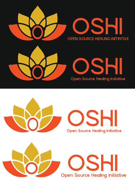
At first, I placed the OSHI font beneath the logo, which was visually effective but lacked clarity about what the organisation represents. This placement did not convey the mission or purpose of OSHI, which is important for building recognition and engagement. To fix this, I repositioned the text to the right of the lotus and included the full name, “Open Source Healing Initiative.” This change ensured that viewers could immediately understand OSHI’s mission and goals upon seeing the logo, creating a stronger connection with the viewer.
The improved placement not only made OSHI’s mission more clear but also aligned the text with the lotus design in a way that maintained visual hierarchy. To ensure the lotus remained the focal point of the design, I scaled the text smaller than the lotus. This created a clear hierarchy, with the lotus symbolising OSHI’s values of renewal and growth, while the accompanying text showed the viewers the context.
This layout makes the logo useable for both digital and physical media. By reinforcing the organisation’s identity in this way, the new logo strengthens OSHI’s brand and ensures its values are clearly shown.
Technical challenges and solutions.
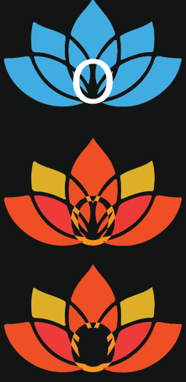
One technical challenge I faced was finding a way to modify the OSHI lotus logo to add depth and more meaning. I decided to add the “O” from OSHI into the centre of the lotus. This was difficult as using the pathfinder tools created unintended results. I eventually resolved this by using the shape builder tool to clean up excess patterns, which left a clear space in the centre where I could place the “O.” On reflection, I realised that a simpler solution could have been to use a solid sphere to create the central hole, avoiding the additional steps with the shape builder tool. This reminded me that there are many and simpler ways to achieving desired effects inside illustrator.
Feedback received and how it was integrated.
While working on the high fidelity website, peer feedback I received was that the yellow block used in the banner blended too much with the sunset photo background, making it less visible. Based on this feedback, I changed the block to an orange colour. This adjustment improved contrast and readability while still aligning with the OSHI rebrand’s colour palette. The orange tone complemented the sunset and helped the banner stand out as a call to action.
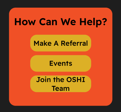
The second version of the Call To Action button was an improvement, but it was still not good enough for the website. During peer feedback, it was said that the spacing on the left and right sides of the rectangle felt too close to the “How Can We Help” title which led to the Call To Action look cramped. Additional feedback stated that the button text appeared too big, taking away from the overall balance and readability of the design.
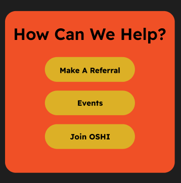
The third version of the Call To Action features more curved edges for the three buttons inside the orange rectangle. This change was made to better distinguish the buttons from the background, as using the same corner radius for both had made them visually blend together. I also reduced the text size based on peer feedback, improving overall coherence. However, despite these adjustments, the design still did not look right.
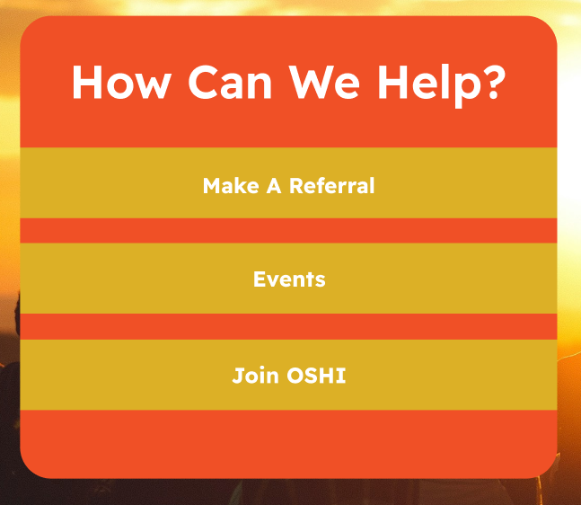
In the final version of the Call To Action button, I removed the corner radius and stretched the yellow boxes to the edges of the orange rectangle. This adjustment created a cleaner and sharper look, ensuring the buttons stood out more prominently. Additionally, stretching the yellow boxes to the edges of the orange rectangle increased the visual contrast and clarity, making the buttons immediately distinguishable as interactive elements.
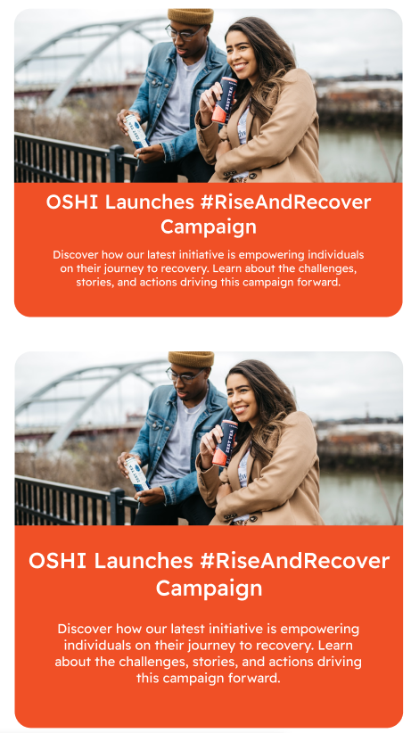
While designing the “What’s On At OSHI” news page, I prioritised creating a large news tab to highlight the #RiseAndRecover campaign. This button sits on the right side to the mass body text, ensuring the campaign is a focal point to users.
The first version of this design, displayed at the bottom of the image, features a wide title and a slightly shorter block of body text. However, upon review, I noticed leading at the bottom of the button, which created an unnecessary blank orange strip. This blank space disrupted the visual balance, making the layout feel offset. The title also appeared cramped due to it being close to the side edges which made the design feel off-balance.
To fix this, I created another version which is at the top of the image. I reduced the backgrounds height to get rid of the leading at the bottom. I also extended the width of the button and aligned the body text to match the titles width. These changes not only created a more harmonious and symmetrical design but also improved the clarity and focus of the button. As a result, the final version feels much more symmetrical and effectively draws attention to OSHI’s new campaign.
Specific instances where sustainable and ethical practices were applied.
One sustainable practice used in the OSHI rebranded website is the addition of the dark mode button located at the top of the site. This button allows the user to switch between a light and dark mode, this not only helps with accessibility for visually impaired users as it will help with readability of text but also will reduce energy consumption on OLED and AMOLED screens.
Final design presentation with detailed explanations. / Low/Mid/High fidelity mockups with explanations.
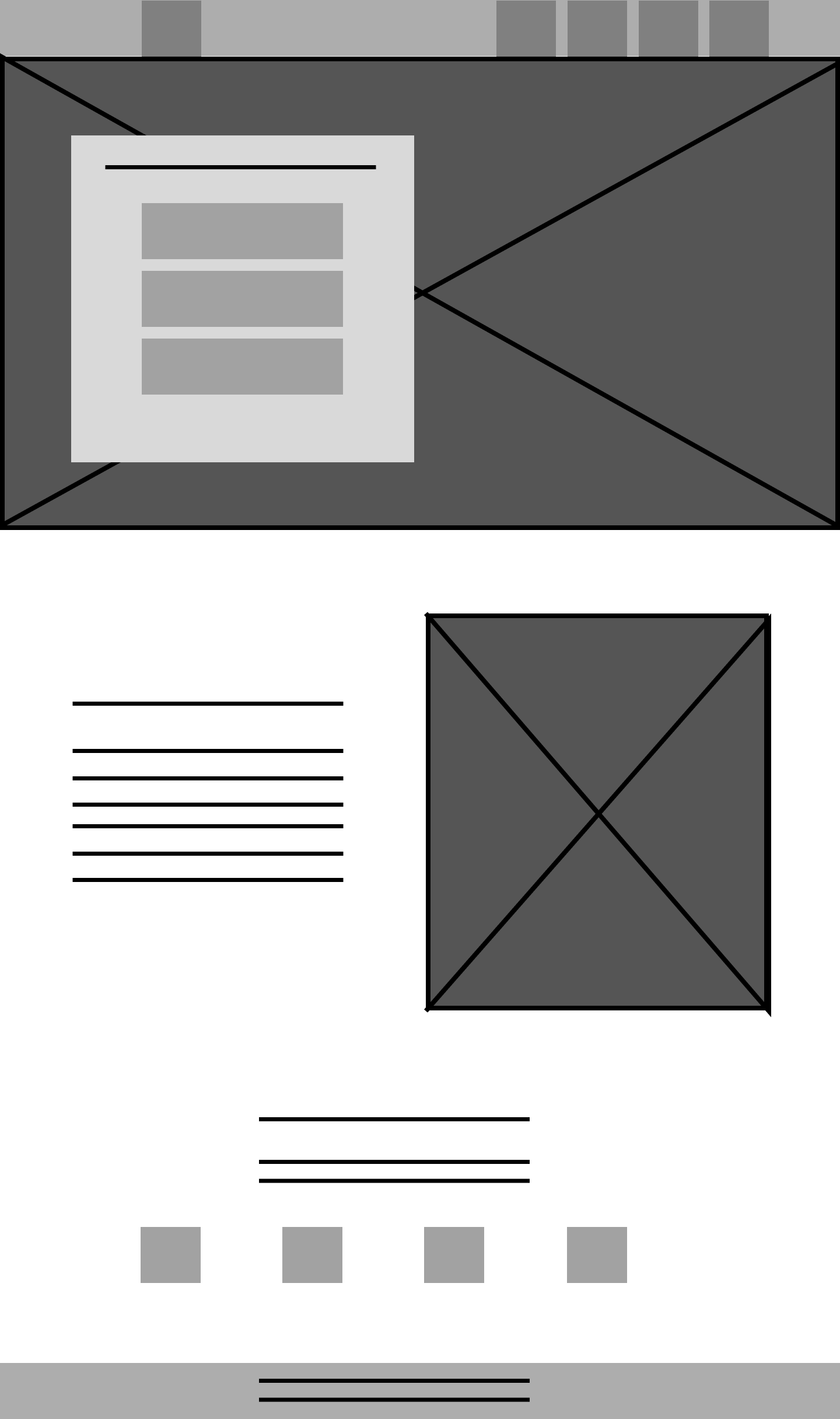
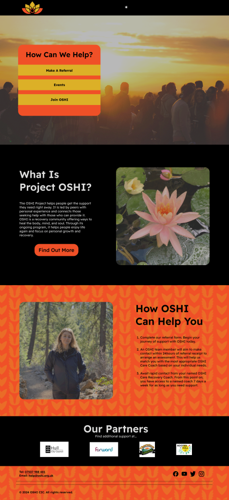
The first low-fidelity design focused on creating a refreshed main page for OSHI. The goal was to divide the page into three distinct sections, each showing a clear understanding of what OSHI is and how it operates. These sections were planned to provide an overview of OSHI’s mission, highlight how it can help, and guide users toward accessing the help they need. This makes the page intuitive and welcoming, ensuring that users could easily navigate to the support options most relevant to them.
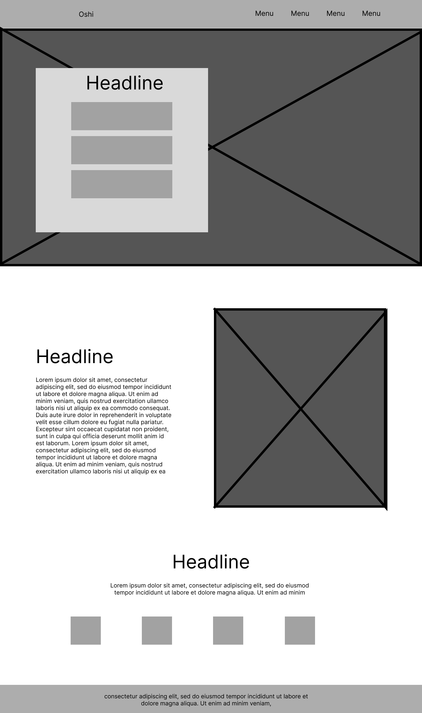
Next, I refined the existing elements by adding more details to help visualize how the webpage would look and function. This stage involved incorporating actual headlines and body text. By this point, I was confident in the layout and focused on ensuring the content aligned well with the overall structure, providing a clearer layout by using the Figma grid system.
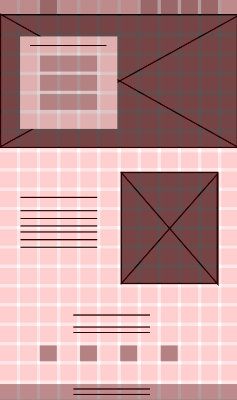
This is the mid-fidelity grid design for the webpage, the grid system is to ensure a well-spaced and balanced layout. I used a 21-row by 12-column grid for this. The high number of rows was due to the page’s length, requiring more rows to maintain an equal square grid. Using this grid system, I used consistent spacing by leaving a one-block gap between key elements. This ensured symmetry across the layout, allowing the design to appear organised and visually pleasing.
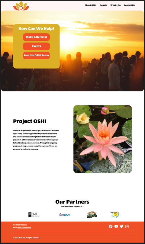
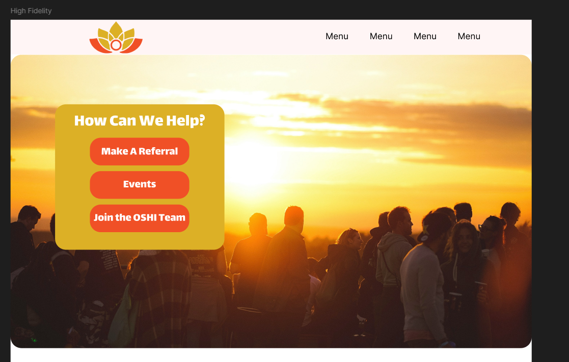
This is my first attempt at high fidelity, following the layout from my previous fidelity versions. I included a sunset banner at the top to incorporate and reference back to the OSHI logo as the colours used in the logo represent a sunset to show a new beginning for those struggling with addiction. I chose a bold and rounded typeface for the title and body text to link back to the lotus pieces used in the OSHI logo. The issue with this layout is that the third bottom section has too much leading regardless of the placement of the imagery and text. Overall the page felt lacking.
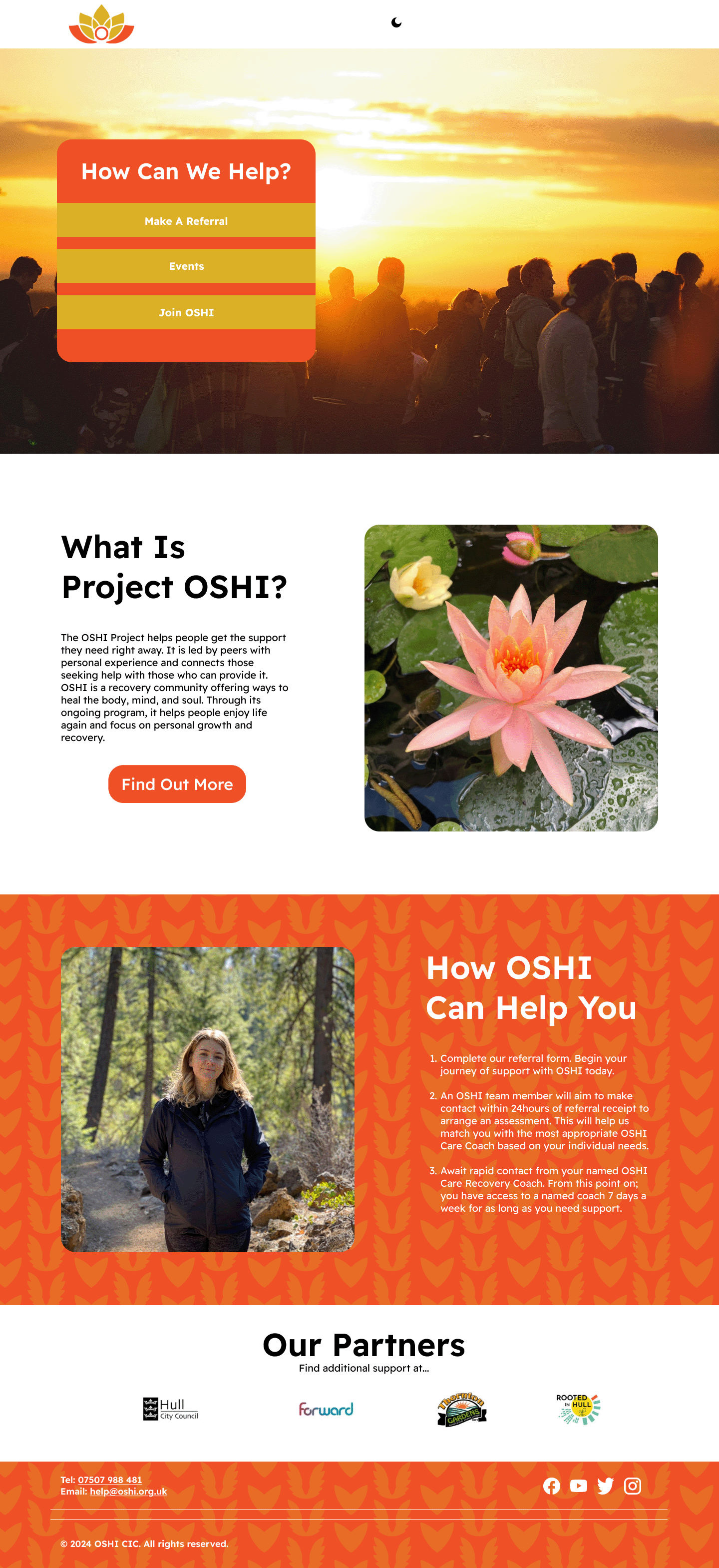
This is the complete High Fidelity version, In this version I added an extra “How OSHI Can Help You” section. I added this section last instead of underneath the interactive “How Can We Help” due to the serial position effect. As Lavery, T (2017) states “The serial position effect is the psychological tendency to remember the first and last items in a list better than those in the middle.” This means that users who access the site will remember how OSHI can help them more than the middle section which is not as important to the user.
The final version of the main page incorporates the new OSHI brand pattern, adding an eye-catching element to the design. This pattern can be reused across various media as a background, enhancing the visual appeal and providing depth to any composition. The pattern features two symbolic elements created from the lotus pieces of the OSHI logo. The heart represents the support offered by the OSHI community, while the wings symbolise freedom from addiction. Together, they show OSHI’s mission of hope and empowerment, making the pattern both meaningful and visually impactful.
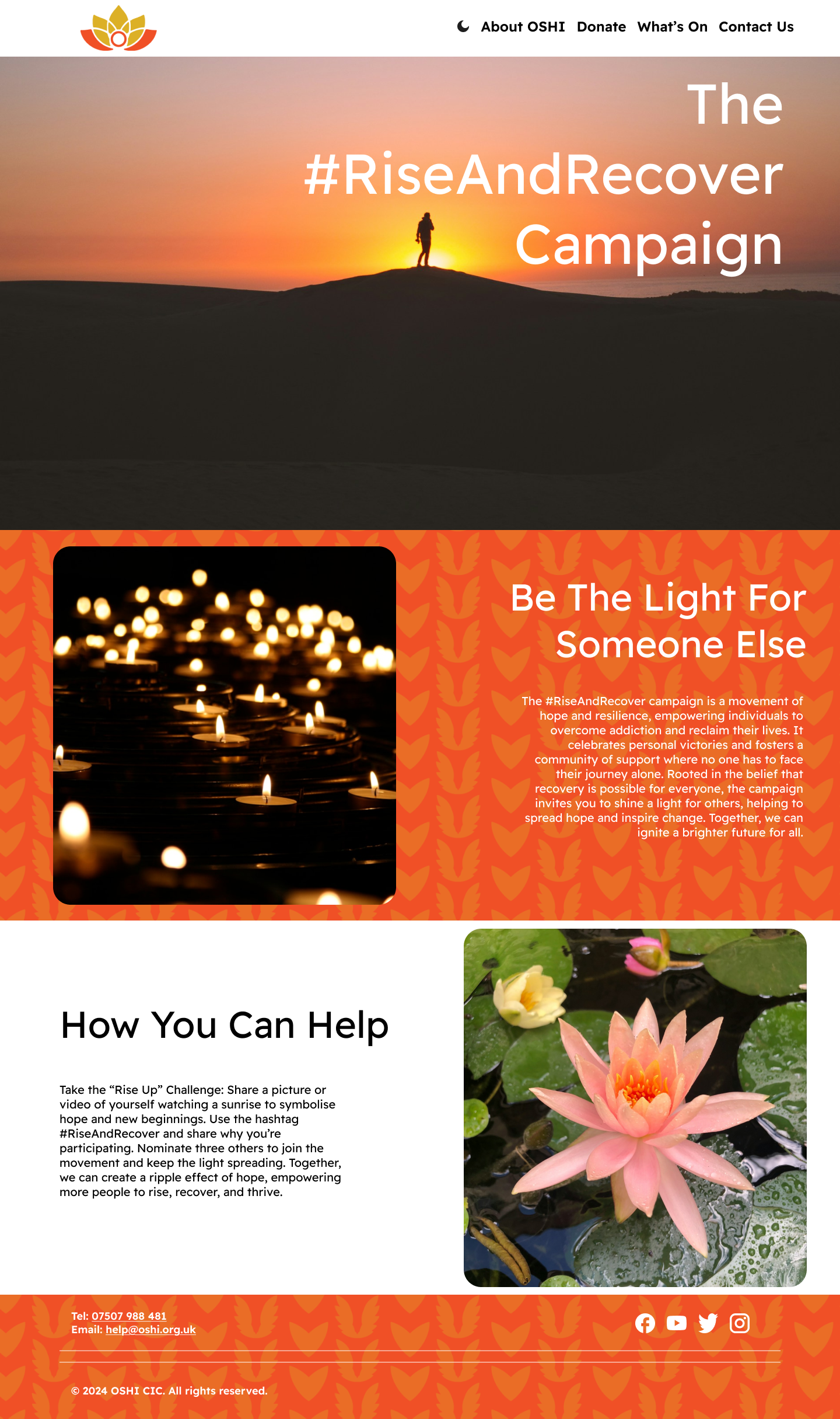
My next priority was promoting the campaign on the website, as this was essential for the next phase of the assignment. I added a sunset banner at the top of the page to symbolise new beginnings; the imagery of the sunrise aligns with OSHI’s mission of hope and renewal. This choice also ties back to the OSHI logo, where the orange and gold colours promote the warmth of a rising sun.
Below the banner, I included a “Be The Light For Someone Else” section, showing a introduction to the campaign. To make the page more engaging, I added a “How You Can Help” section that directly addresses the user. This interactive element encourages participation and strengthens the connection between the audience and the campaign, making the message more impactful and personal.
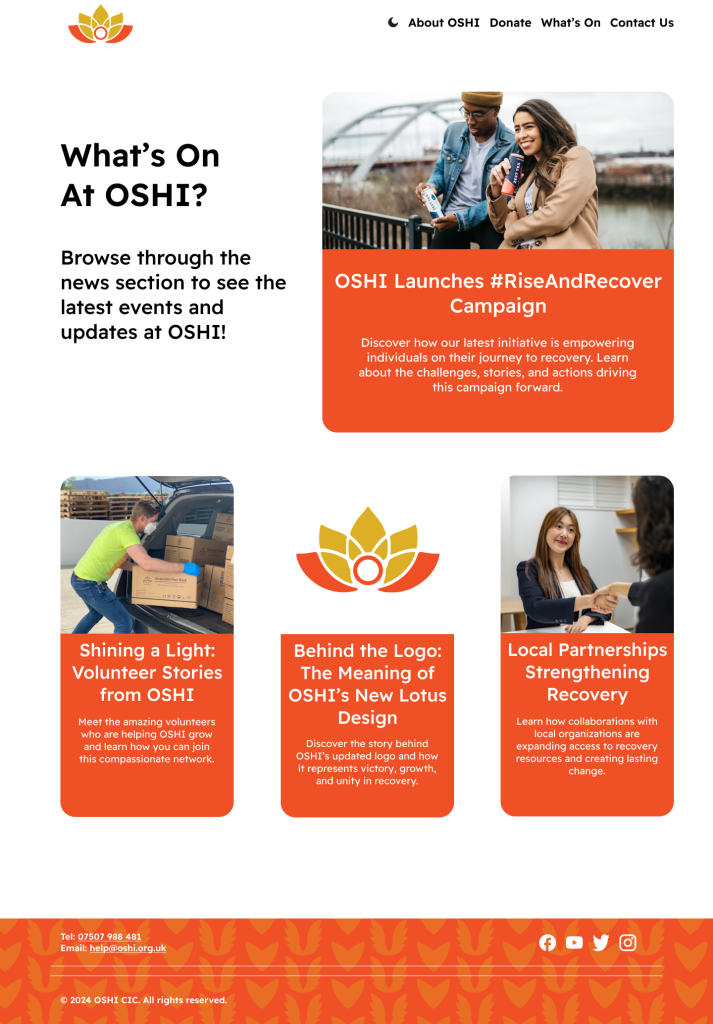
The next page developed was the “What’s On at OSHI?” page, designed to help users stay informed about recent and ongoing events, including the new #RiseAndRecover campaign. This page introduces a different layout style, prioritising interactive buttons and description texts rather than the longer body text used on other pages.
To ensure a visual hierarchy, I created a prominent large news button highlighting the most important and current event at OSHI. Underneath it there are three smaller news buttons, each half the width of the main one, to show the most recent updates. This layout creates a balanced and visually appealing structure, making the content less overwhelming to the user.
For readability, the news tabs do not use the iconic OSHI pattern in their orange backgrounds, as the pattern reduced the legibility of the description text. This choice ensures that the page remains functional and user-friendly while staying consistent with OSHI’s overall aesthetic.
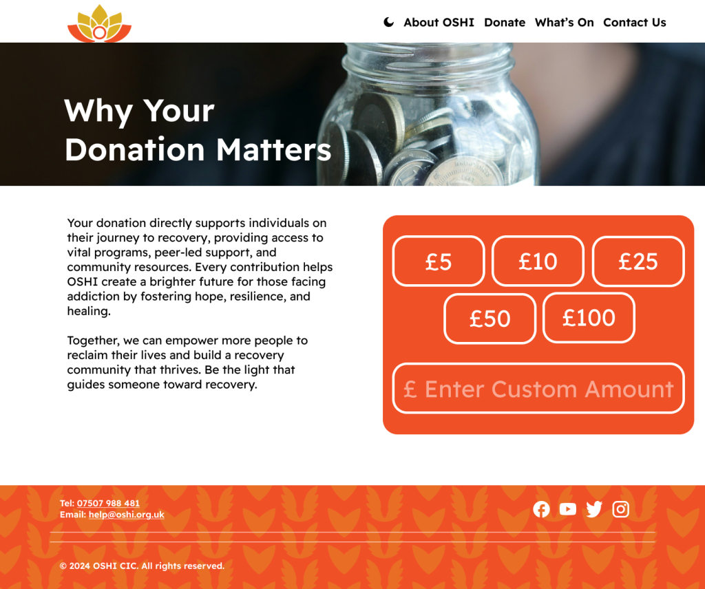
To enhance readability, the donation button was left without a patterned background to ensure its text is clear and to prevent distractions from the design. On the left-hand side of the page, there is a block of text with a title positioned above it. The title is placed within a banner in a white colour, providing contrast and improving readability against the darker image used in the banner background. These changes were made to balance visual appeal with accessibility.
After having created the main four pages, I started to create dark mode versions of them. This is because the original plan from the OSHI proposal was to have the page to start out as black, however this felt too dark to keep as a default and I decided it didn’t effectively show OSHI’s values. However, I still implemented it as a togglable button at the top of the page due to accessibility and environmental reasons.
One positive of this is that dark mode offers better readability for users with light sensitivity or visual impairments, reducing glare and eye strain especially for users in lowly lit environments. Another positive and implementing this is that on OLED and AMOLED screens having a dark mode will decrease the amount of energy consumption which aligns with OSHI’s emphasis on sustainability.
However, there is a drawback to this dark mode as dark mode reduces eye strain for some users and it can pose difficulties for others, such as those with specific types of dyslexia or visual impairments where light text on dark backgrounds is harder to read. This is why having the black background as the default would have been a drawback and implementing the toggle button at the top of the menu on every page is important so that every user can switch between their preferred setting as they choose. This also makes the user experience on OSHIS site more interactive and enjoyable.
Lavery, T. (2017) What Is Serial Position effect? https://www.techtarget.com/whatis/definition/serial-position-effect [Accessed 4 Dec. 2024].