Introduction

The #RiseAndRecover campaign is a new movement aimed at increasing awareness about addiction recovery, dismantling stigma, and creating a supportive and inclusive community. At its core, the campaign reflects OSHI’s mission to inspire hope, healing, and empowerment for individuals in their recovery journey. By mixing refreshed branding with a new digital communication strategy, #RiseAndRecover seeks to amplify OSHI’s reach, ignite meaningful engagement, and drive social change.
In an era where digital platforms shape public perception, a new brand identity paired with effective communication is vital. A strong identity allows organizations like OSHI to resonate with their audience, conveying their purpose and values in a way that inspires trust and action. The campaign integrates a new visual identity, an engaging multichannel marketing strategy, and ethically sourced merchandise, ensuring every aspect reinforces its message of hope and recovery.
From interactive challenges like the Sunrise Challenge to impactful social media posts, the campaign meets its audience where they are, creating participation and community spirit. Together, these elements position OSHI as not only a resource for recovery but also a movement for positive change, making #RiseAndRecover a beacon of transformation for all.
Brand Identity
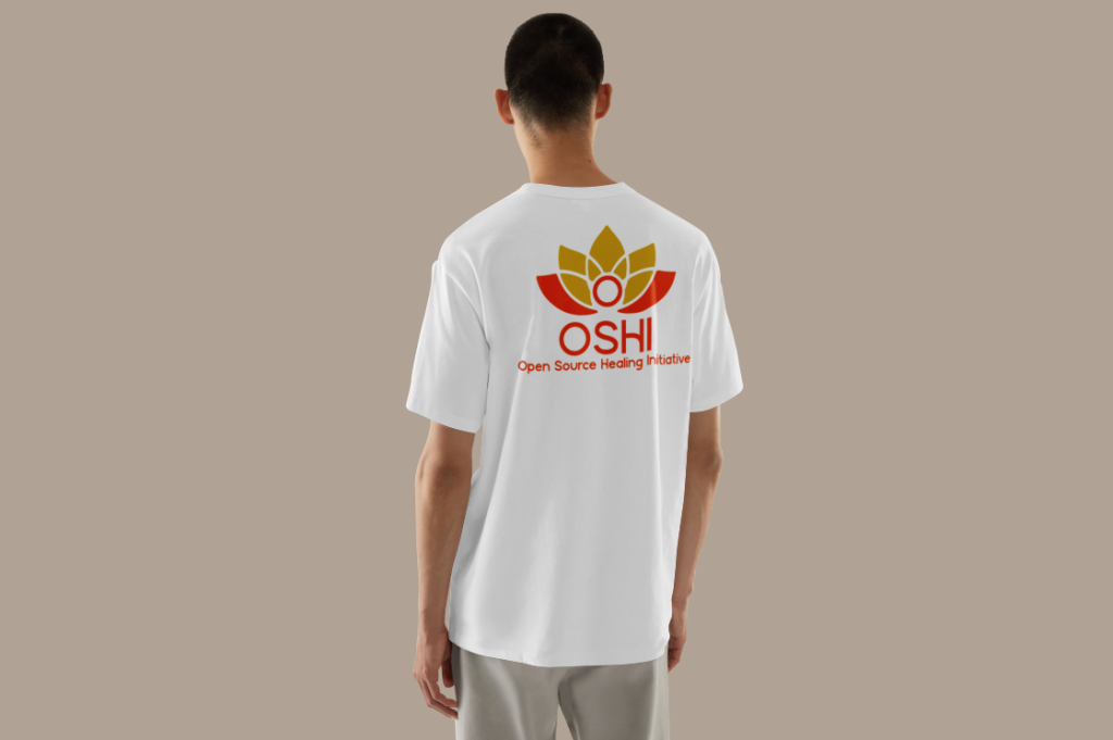
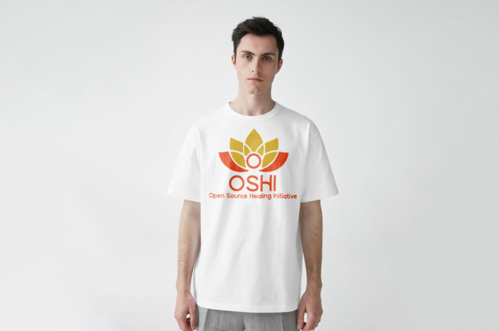
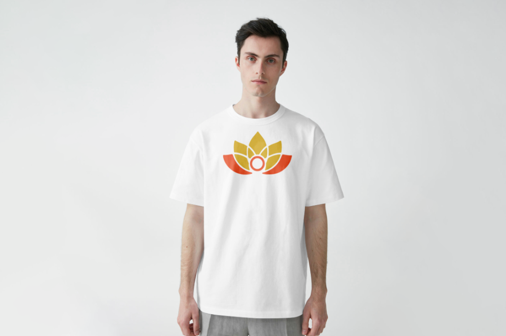
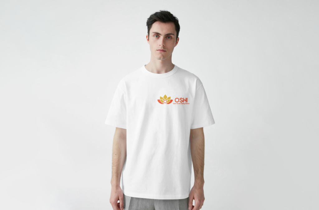
At the heart of OSHI’s rebranding is a refreshed visual identity that symbolises hope, resilience, and renewal. At the centre of this transformation is the redesigned OSHI logo which is a lotus flower that uses gold at the top of the lotus and orange at the bottom pieces. Each element of the logo was carefully chosen to embody OSHI’s mission and values.
The lotus which is a universal symbol of growth and rebirth, reflects the journey of recovery and emerging stronger and more vibrant despite life’s challenges. The colour palette is equally meaningful as gold represents empowerment, achievement, and positivity, reinforcing OSHI’s commitment to inspiring success in recovery. Orange adds warmth and energy, creating a welcoming and approachable aesthetic.

Typography plays a critical role in reinforcing this identity. A sans-serif font was selected for its clean, modern look, aligning with the approachable and inclusive ethos of OSHI. It was then edited to have rounded edges to match the rounded edges of the lotus pieces. The text is positioned to the right of the lotus, ensuring the symbol remains the focal point while providing context through the tagline “Open Source Healing Initiative.”
This visual identity extends across all campaign touchpoints, from the website to social media content and merchandise. Consistency is key in fostering brand recognition and trust, especially for a cause as sensitive and impactful as addiction recovery. The refreshed design language communicates OSHI’s mission while making the brand memorable and inviting for its audience.
This refreshed brand identity has the power to be versatile across various media such as t-shirts, websites or posters which reinforces OSHI’s values and core beliefs. Recovery can be found anywhere.
Campaign Overview
The #RiseAndRecover campaign is designed as a multichannel effort to increase reach, engagement, and impact. At its core is a social media driven strategy that uses the power of user created content, storytelling, and community engagement.
The campaign’s initiative, the Sunrise Challenge, encourages users to photograph and share sunrises with the hashtag #RiseAndRecover. Symbolising new beginnings and hope, the challenge not only spreads awareness but also creates a sense of unity among participants. This initiative aligns with OSHI’s mission by turning a simple daily act into a powerful statement of resilience and renewal.
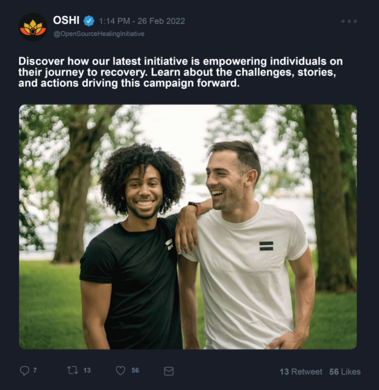
Social media platforms like Instagram, Twitter, and Facebook play a crucial role in the campaign. These channels feature a mix of content, including inspiring recovery stories, educational posts about addiction, and interactive elements like polls and Q&A sessions. This ensures the campaign remains engaging while addressing the needs and interests of diverse audiences.
In addition to digital outreach, the campaign emphasises ethical practices. Messages are crafted to be inclusive, showing the varied experiences of those in recovery. Sustainable merchandise further reinforces OSHI’s values, offering various ways for supporters to engage with the campaign while promoting environmental responsibility.
Potential partnerships with influencers and organisations in the mental health and recovery spaces amplify the campaign’s message. Collaborations ensure that #RiseAndRecover could reach a broader audience.
Through its integrated strategy, #RiseAndRecover not only raises awareness but also creates a supportive ecosystem where individuals feel empowered to share their stories, seek help, and support others. This ensures the campaign’s impact extends far beyond its digital presence, creating change in the lives it touches.
Website Redesign
A key part of the #RiseAndRecover campaign is the redesigned OSHI website, which serves as a hub for information, resources, and community engagement. The site prioritises functionality, accessibility, and user experience, ensuring it meets the needs of all visitors.
The homepage prominently features the campaign, with clear calls to action for participating in the Sunrise Challenge, donating, or exploring recovery resources. This clear design ensures users can easily navigate to their desired content, reducing obstacles to engagement.
Accessibility is a cornerstone of the redesign. Features like the dark mode make the site usable for individuals with visual impairments or other disabilities. A togglable dark mode not only improves readability for many users but also reduces eye strain and conserves energy on OLED screens, aligning with the campaign’s commitment to sustainability.
Beyond accessibility, the website uses various dynamic elements to keep users engaged such as the integration of OSHI’s new brand pattern throughout the site which adds an iconic element while reinforcing the organisation’s identity.
The website also includes a dedicated merchandise store, offering eco-friendly products that support the campaign’s message and mission. Items like organic cotton apparel are showcased with professional photography making them appealing to potential buyers.
By combining aesthetic appeal with practical functionality, the redesigned website ensures that visitors not only feel welcomed but are also inspired to take action. Whether sharing their story, joining the campaign, or supporting OSHI through a purchase, users can easily connect with the organization’s mission in meaningful ways.
Merchandise
Merchandise serves as a powerful tool for the #RiseAndRecover campaign, combining support with a message of hope and sustainability. Each product is designed to reflect OSHI’s values and inspire conversation around addiction recovery.
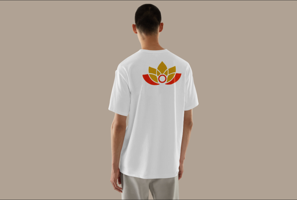
Eco-friendly materials are a priority, with items like organic cotton T-shirts made from recycled fibers. These products not only reduce environmental impact but also align with OSHI’s commitment to ethical practices. By promoting sustainability, the merchandise reinforces the campaign’s broader message of renewal and responsibility.
Each item features OSHI branding, these designs carry symbols of the campaign’s mission which spreads OSHIs mission wherever the customer wears them.
The merchandise store, accessible through the redesigned OSHI website, ensures that supporters worldwide can contribute to the cause. Proceeds from sales directly fund OSHI’s initiatives, creating a cycle of support that benefits both individuals in recovery and the organisation as a whole.
Merchandise is more than just a revenue stream as it’s a way to foster community and spread the campaign’s message far and wide. By incorporating ethical design and production practices, the #RiseAndRecover merchandise creates a system where the money brought in can be used to expand OSHIs reach further than the local community.
Social Media
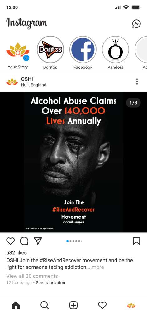
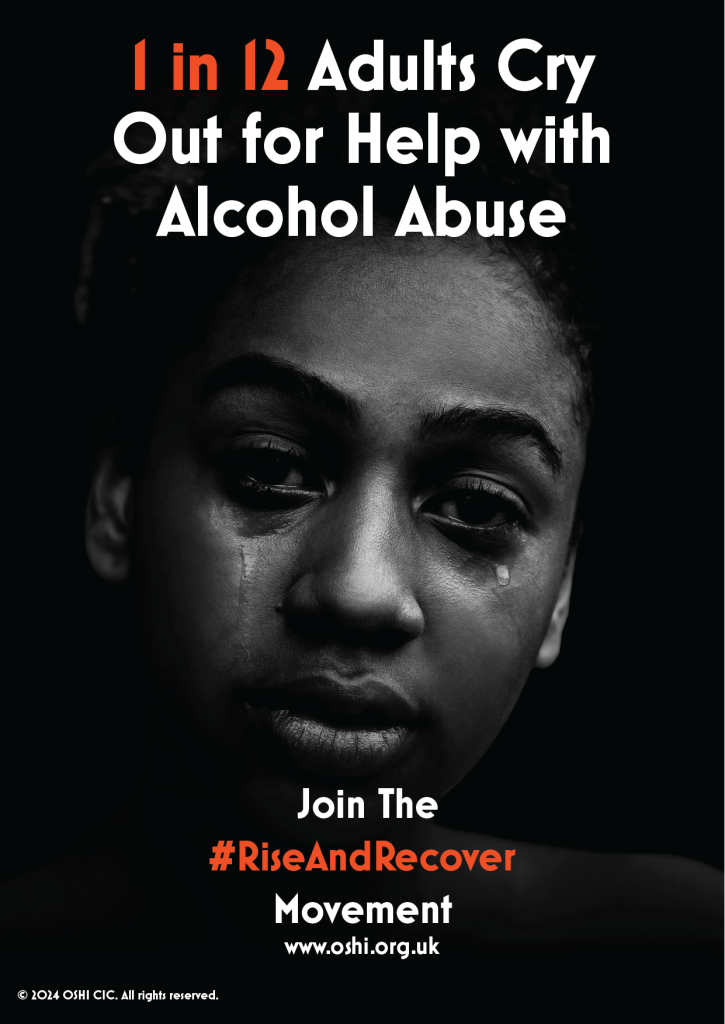
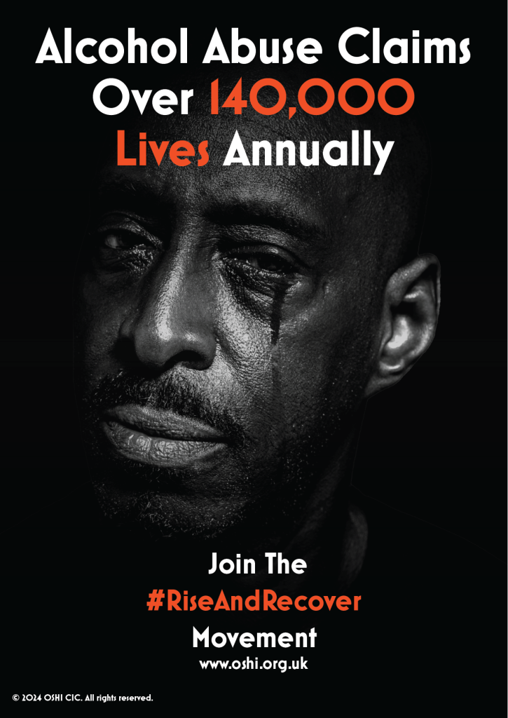
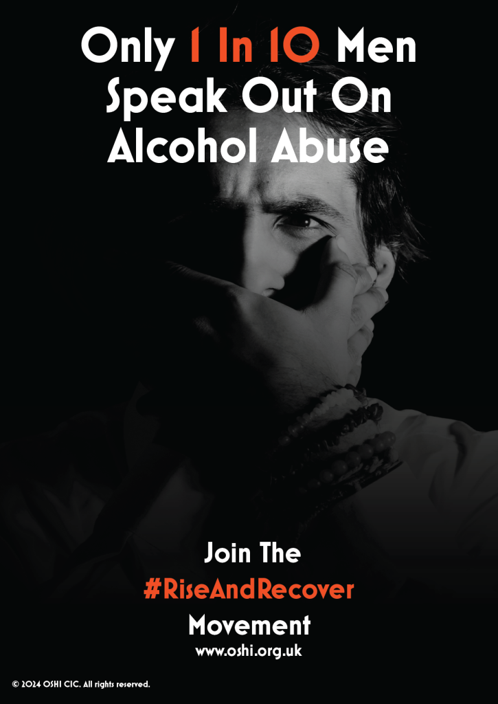
The #RiseAndRecover campaign also stretches out onto various social media platforms such as Twitter and Instagram. This reinforces OSHIs accessibility by being widely available online on various platforms for everyone to access. This also helps spread the campaign further and helps OSHI increase the numbers supporting their movement by posting about important information such as infographics and success stories.
Conclusion
The #RiseAndRecover campaign embodies a new approach to addressing addiction recovery and stigma. By combining a refreshed brand identity with a strategic multichannel effort, it creates opportunities for engagement, education, and empowerment.
The refreshed OSHI branding, with its meaningful logo and colour palette, serves as a powerful visual representation of hope and resilience. The campaign’s social media initiatives, including the Sunrise Challenge, which uses the power of storytelling and community participation to break down barriers and foster understanding.
The redesigned website, with its accessibility features and user-friendly design, ensures that individuals can easily access resources, share their stories, and support OSHI’s mission. Ethical practices, from inclusive messaging to sustainable merchandise, further reinforce the campaign’s values, making every interaction with #RiseAndRecover a step toward positive change.
Overall, the movement results in increased awareness of addiction recovery, reduced stigma, and stronger community support. By inspiring action, whether through sharing a sunrise photo, purchasing eco-friendly merchandise, or donating. #RiseAndRecover empowers individuals to contribute meaningfully to a movement of hope and transformation.
Video
References
MockupWorld. (2019). Mockup World | the Best Free Mockups from the Web. https://www.mockupworld.co/ [Accessed 20 Dec. 2024].
Pixelbuddha Free and Premium Design Resources of the Highest Quality. (n.d.) https://pixelbuddha.net/ [Accessed 21 Dec. 2024].
Unsplash | Figma Community. (2023) Figma. https://www.figma.com/community/plugin/738454987945972471/Unsplash [Accessed 21 Dec. 2024].